Feminista Journal
Feminista is a non-profit online platform dedicated to providing insightful feminist perspectives on various aspects of life. The Feminista Journal is open to women of all ages, allowing them to contribute articles on a diverse array of topics, including parenting, work, mental health, and more. The content is editorially curated, offering a space for women to share thoughtful insights.
Given that the articles submitted to the website will come from different contributors, they may vary significantly in length and may or may not include visual imageries, which might not always align with the brand’s identity. Consequently, it is crucial for Feminista’s brand and website to remain flexible and visually engaging, whether or not the content includes photos or imagery. To address the challenges, we opted to develop a brand language focused primarily on typefaces.
Category
Branding Identity & Digital Website
Sector
Non-profit organisation
Credits
Anna Rees-Jones (Design Intern)

The Heldane typeface was selected for the logo due to its high-contrast design with sharp features and triangular serifs, embodying Feminista's core values of clarity and honesty. Additionally, the use of expansive negative space in the brandmark symbolizes Feminista's adaptability and openness to receiving feedback and diverse perspectives from its audience.


Geometric Shapes to Represent Diversity
These illustrations were designed as optional placeholders for instances when submitted articles lack visual content. The diversity of the women audience and contributors within Feminista's primary demographic is symbolized by the geometric shapes, including circles, arches, and half-circles. A sense of delicate femininity is conveyed through the choice of soft pink, yellow ochre, and golden orange hues.
Overall, the combination of bold geometric forms with gentle colour palette reflects Feminista's role as a platform that promotes positivity and empowerment for women.
Art direction & guidance were provided to Anna, the design intern, for the creation of this set of brand illustrations.


Branding Application for Website
Drawing inspiration from newspapers such as The New York Times, we experimented with various editorial typefaces and glyphs in different shapes and sizes.
This distinctive and refined approach was chosen to portray Feminista as a brand that exudes both confidence and intellectual depth in a subtle yet distinctive manner.
See Feminista Journal website here
*Note that the website was completed and handed over to Feminista in 2019. There may have been alterations made independently by Feminista or other designers and developers since then.


Here’s a glimpse of some of the designs that didn’t make it to production but are still valued and preserved in file.

Logo Trials
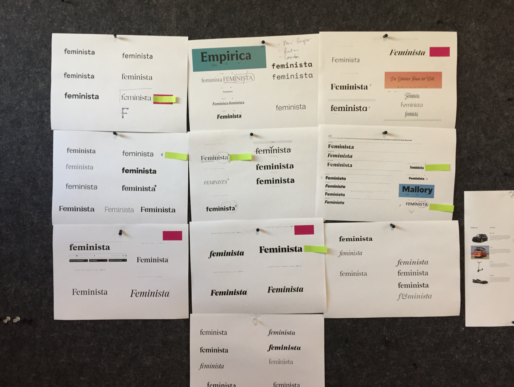
Logo Trials

Logo trials

Website Concept Trials
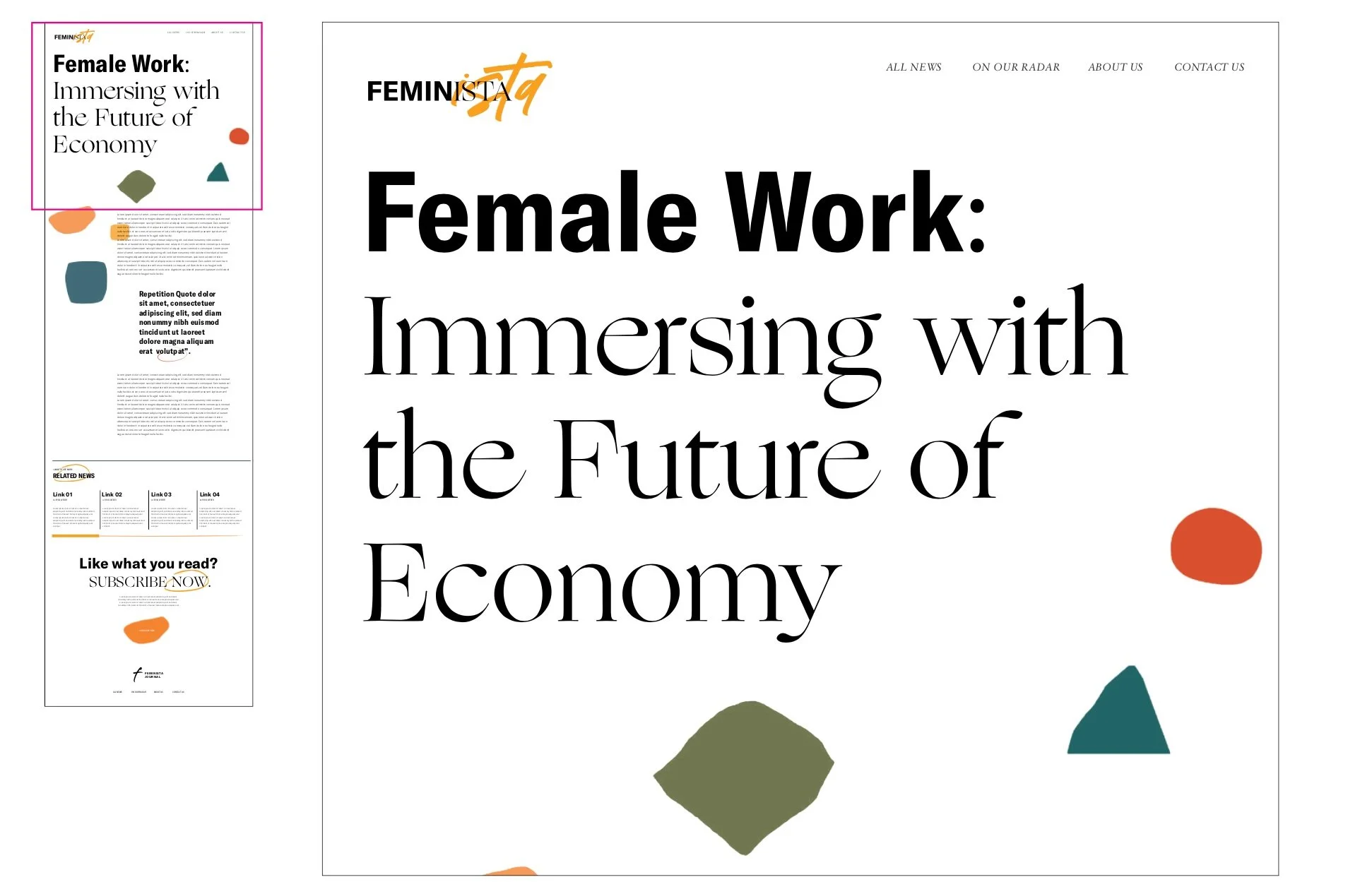
Website Concept Trials

Website Concept Trials