Francis Lim
Category
Branding & Identity, Digital Website
Sector
Corporate, Law
My role
Lead Designer
Collaborators
Coire J. (External web developer)
A little bit about the project.
Project Brief & Challenges
Francis Lim is a family-run Christian law firm who endeavors to provide its clients with compassionate, prompt, honest, most cost-effective, and economically viable resolution of their needs/problems within the legal and statutory framework of Australia. Francis, the owner of the firm, came as an immigrant to Australia in 2000.
Ever since then, Francis and his team have a passion to serve the Asian communities here who needs their lawyer, tax, or migration services. Their main target audience is Asian business owners, migrating Asian families, Asian communities with limited English-speaking capabilities, and Asian Christian communities. Francis approached us as he wanted us to do a re-brand for his firm. The scope of this project is branding identity and a digital website.
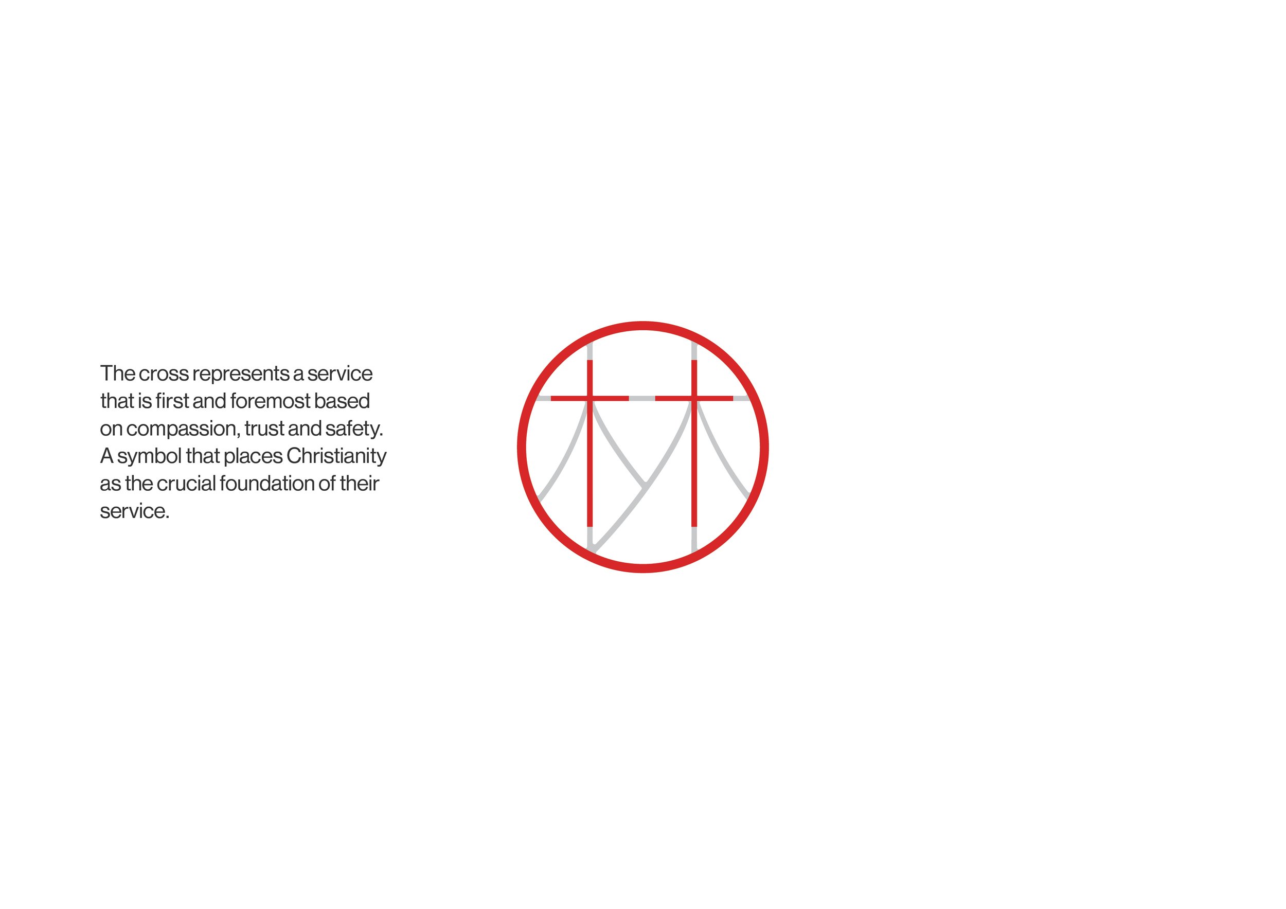
Due to their specific niche and historical background, it is important for their new brand to evoke the history of how Francis Lim came about. The brand should also communicate Francis Lim’s expertise within the legal arena, coupled with the firm’s strong Christian ethos.
Concept Rationale
-

Visual Inspiration
We were very inspired by the use of red colour especially because red in many Asian cultures signifies bravery and courage. Red also represents good fortune & prosperity. Personally to Francis, red reminds him of emergency services like ambulance. Just like an ambulance, Francis Lim main purpose is to be their clients’ first point of contact in the case of legal emergency. Francis Lim is always there to help their clients out of difficult situations.
-

Linework Approach for the Logo
There’s something beautiful, smart, and elegant about a simple design solution. We are particularly inspired by minimal linework and the sense of timelessness & versatility it can bring to a brand. We decided to use this approach to create Francis Lim’s new logo. We believe that a linework approach can truly represent Francis Lim as a firm that is agile and adaptive to different legal situations.
-

Chosen colour palette
The colour palette was specifically chosen to represent Francis Lim as a firm that always brings first-class service and solutions to the table. The gold adds a sense of elegance, exclusivity & high performance to the brand without going over the top.
-

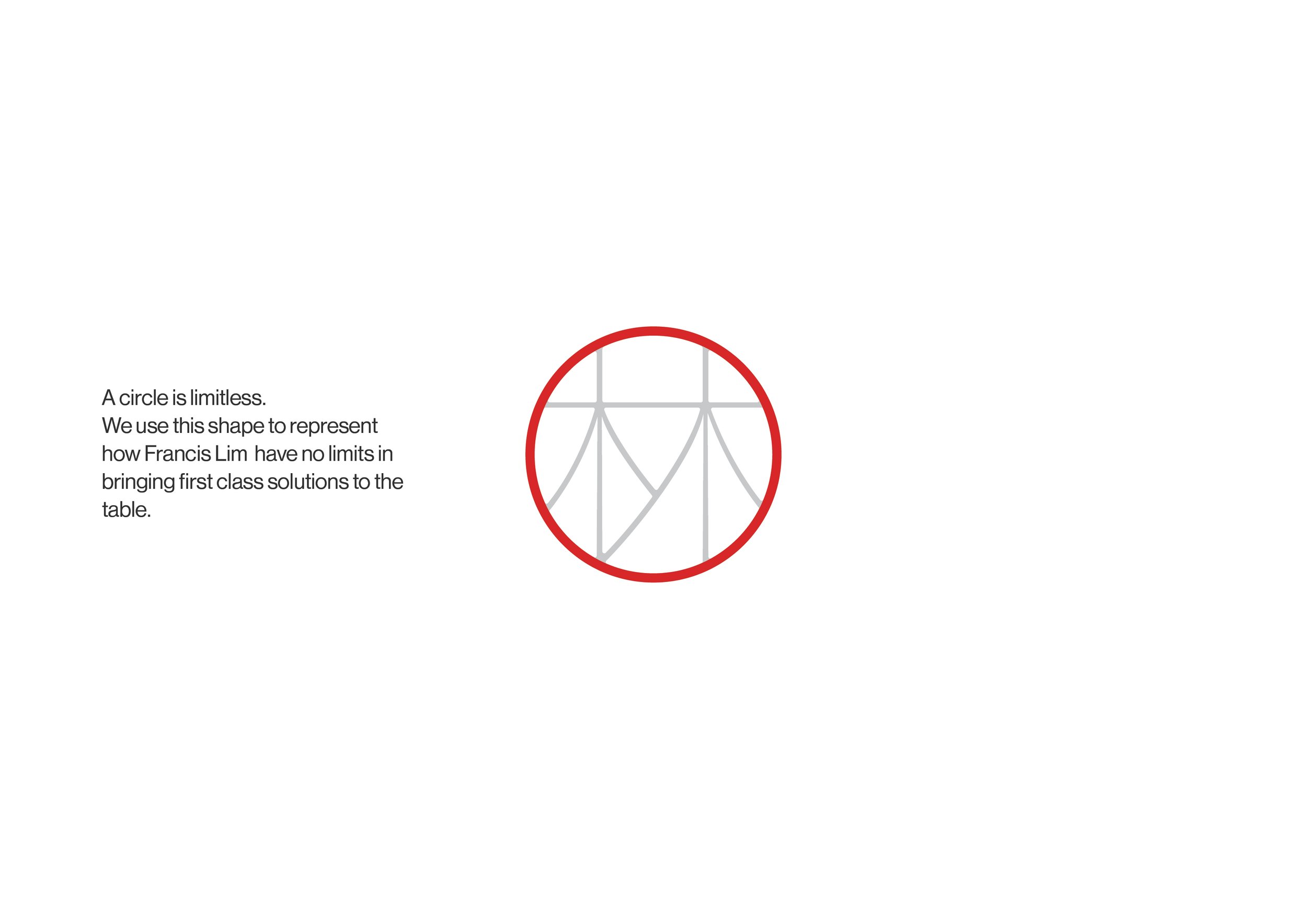
The Lim Character
We were also inspired by the shapes of the “Lim” Chinese character and the role it plays in the history of Francis Lim as a family-based law firm. The Lim character does not only represent Francis’ family name but it also represents the firm’s generational history and lifetime experience in the legal sector.
Final Branding
Through the creation of this logo, our main aim is to visually display Francis Lim as a trustworthy and compassionate firm that provides clients with approachable communication & adaptive solutions.


-

Business Card
-

Email Signature
-

Folder
-

Letterhead


Final Website
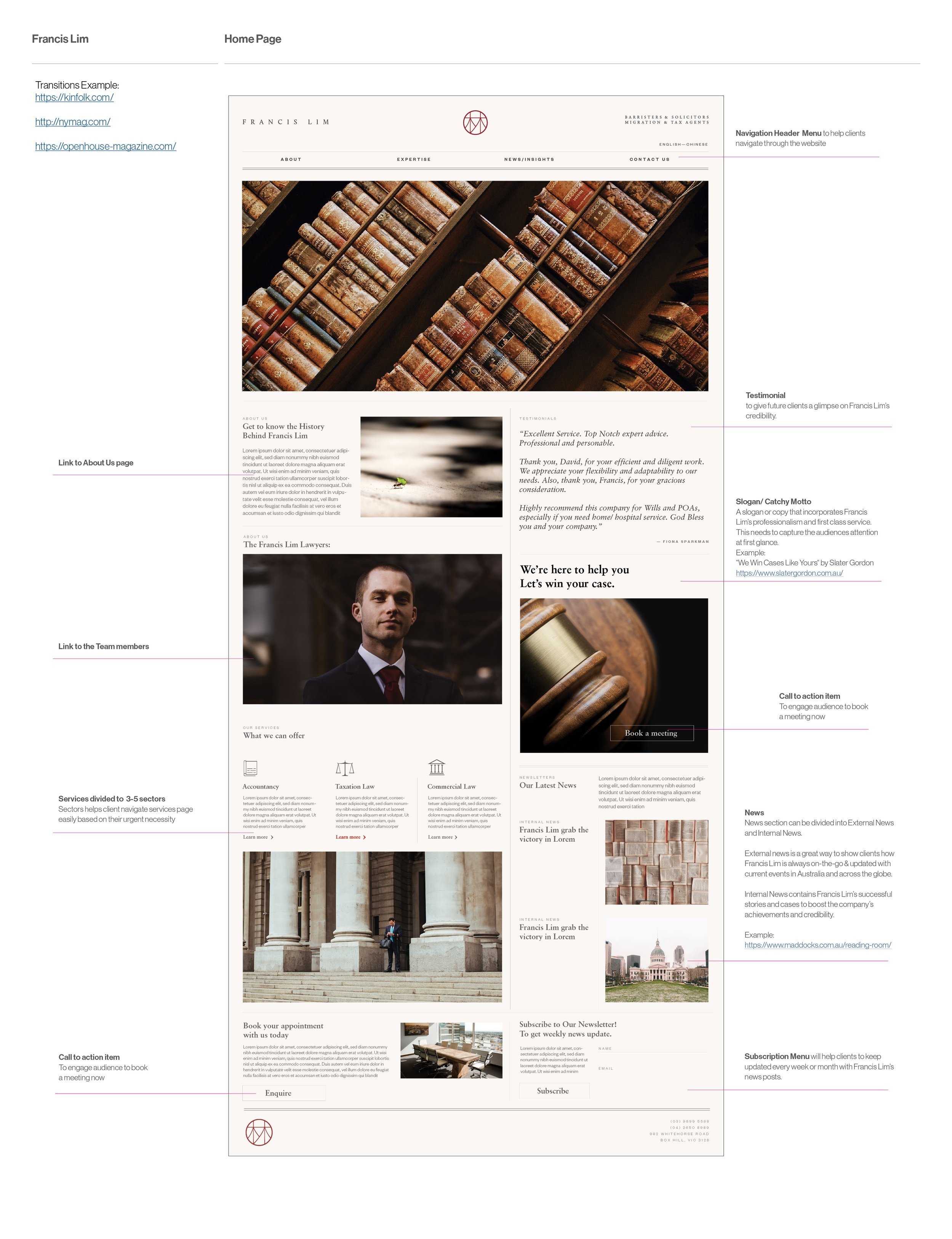
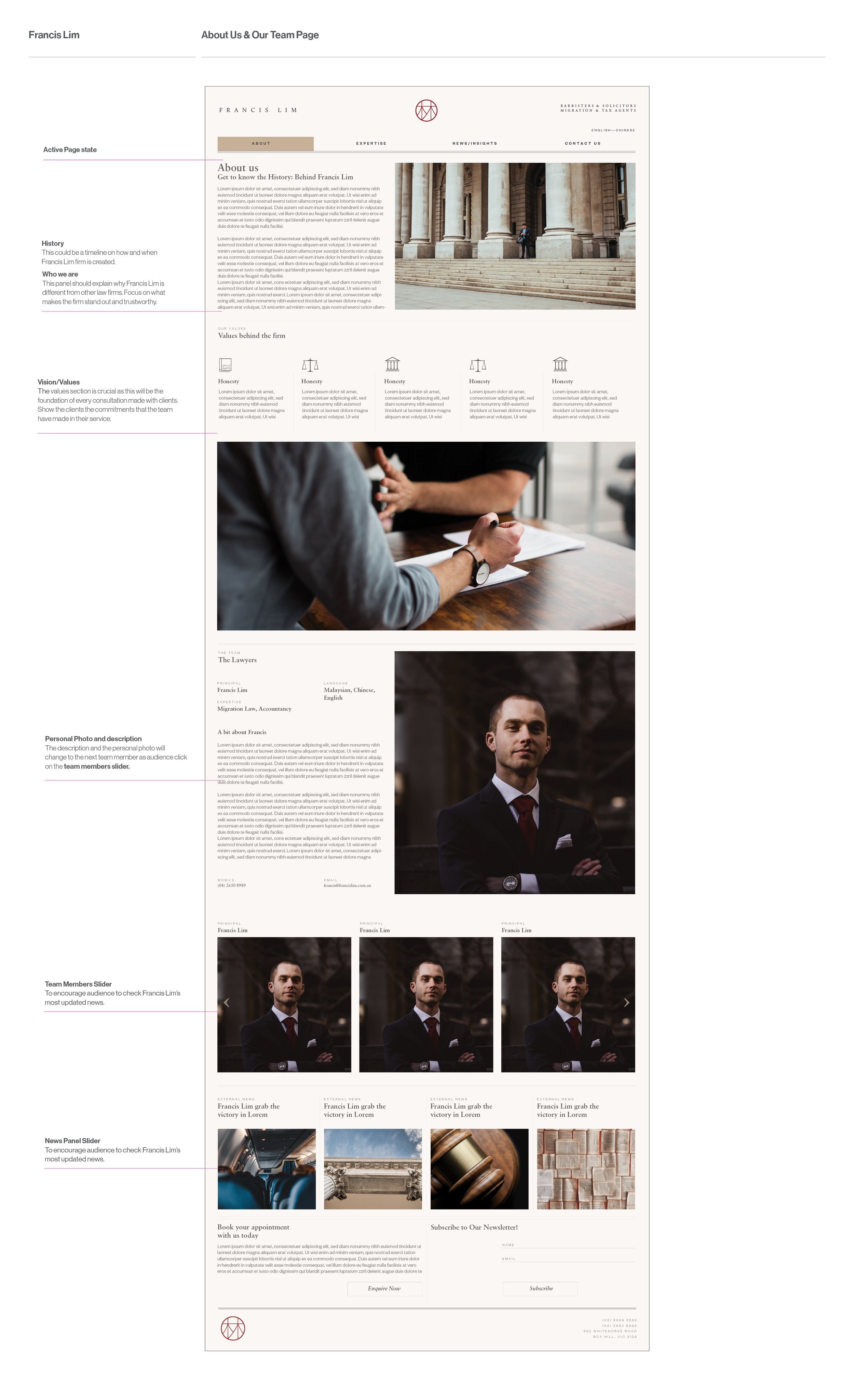

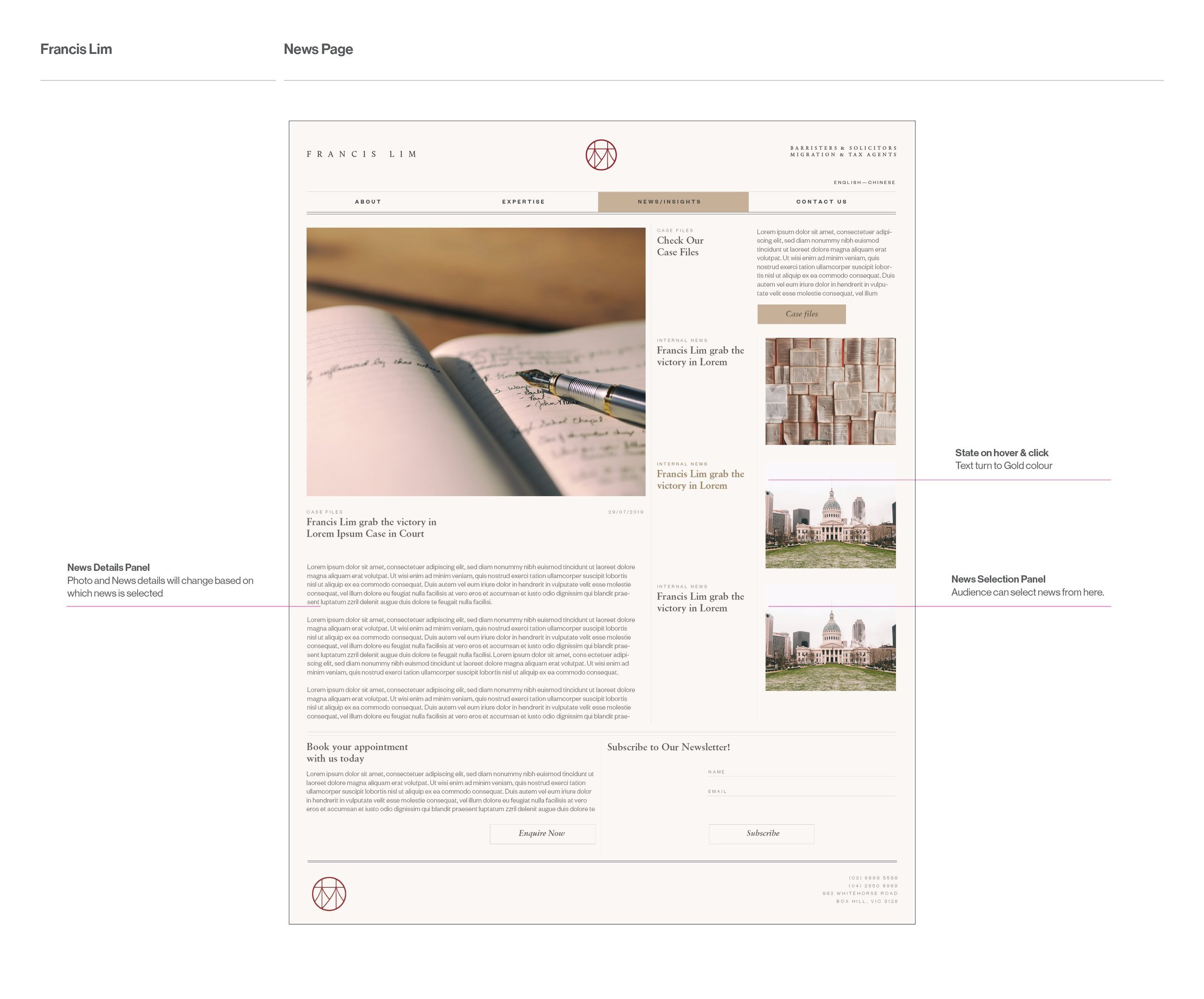
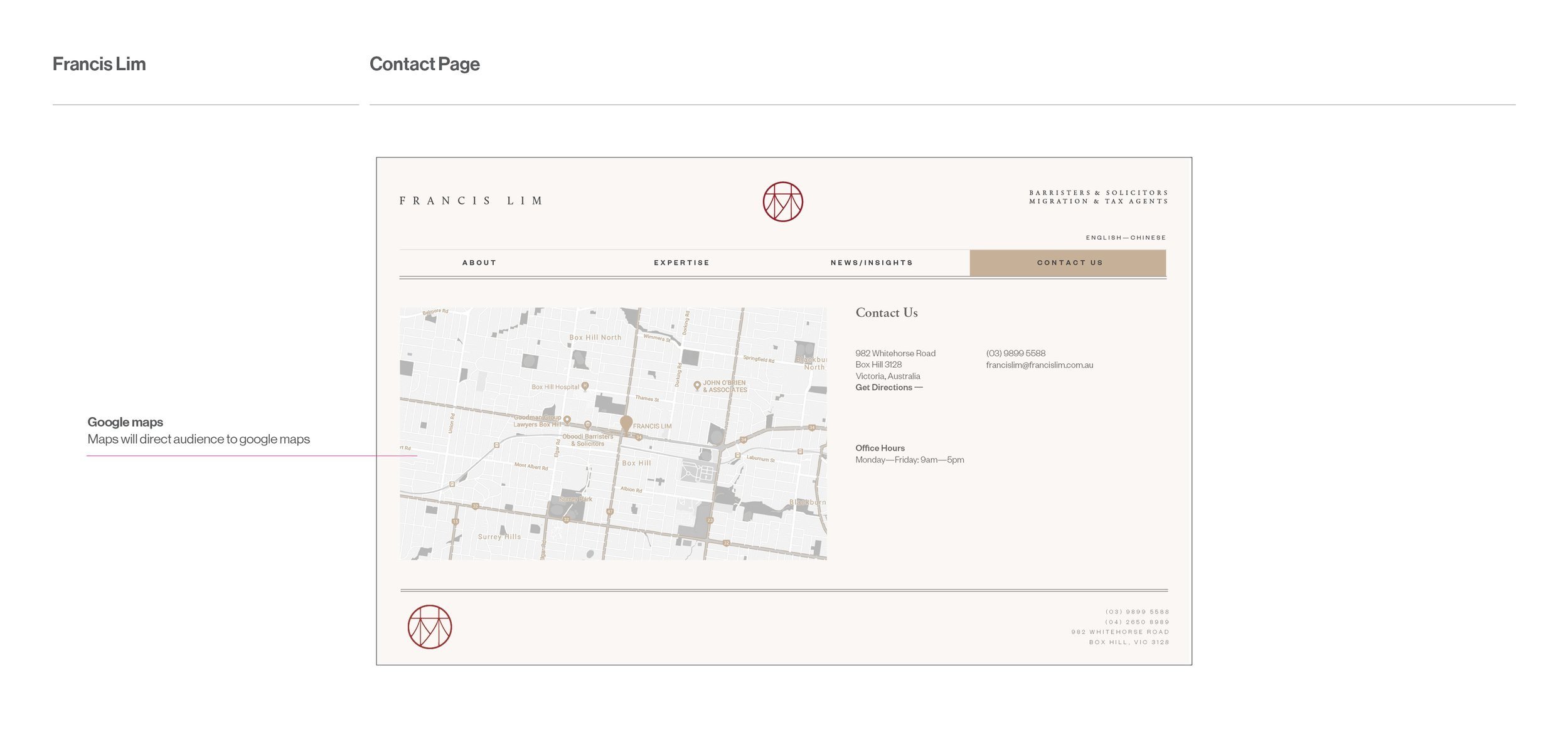
You can see Francis Lim’s website here.
(Please note that the website was done and handed over to Francis Lim in 2019.
There will be some changes made independently by Francis Lim themselves and potentially by other designers/web developers since then.)
The website back-end was developed by Coire, an external web developer.
Here’s a little sneak peek of some of the designs that did not
make it to production but we still cherish and kept in file.


