Yeosin Restaurant
Category
Branding & Identity (new brand), Signage Design
Sector
Food Hospitality
My role
Lead Designer
Collaborators
— Emma P. (Design Director)
— Norman B. (Designer)
— Anna RJ. (Design Intern)
— ArchitectsEAT (External Interior Design Studio)
— Chadstone Westfield Mall
A little bit about Yeosin.
-
Yeosin is a new restaurant in Melbourne that goes under an umbrella brand called Seoul Kitchen— a casual Korean restaurant offering a diverse range of Korean food. However, unlike Seoul Kitchen, Yeosin represents a premium food offering, encompassing a pan-Asian fine dining experience with a twist. The flagship restaurant opened in Westfield Doncaster in mid 2020.
-
1. Exciting
The Yeosin owners wanted their new restaurant to represent an exciting and innovative twist on Korean BBQ. They want to create something completely new and disrupt the usual Korean BBQ market.
Yeosin should bring mayhem and excitement of a hawker market in Asia. Customers come to Yeosin not just for the food but also to delight in a sensory and exciting food experience.
2. Premium & High Quality
Unlike most Korean BBQ places, Yeosin wanted to bring quality spices from other Asian regions to their Korean food. They wanted to offer a new interpretation of Korean BBQ, offering surprising combinations — Szechuan spices on bulgogi beef — paired with premium ingredients which makes for a memorable meal.
3. Accessible
Yeosin is family-friendly and reliable. There is something on the menu that appeals to everyone.
Stakeholder Map
Yeosin is a new food business that does not necessarily have an existing clientele as its food offering is different from its umbrella brand, Seoul Kitchen. So to understand Yeosin’s target audience better, we did research and site visit on Yeosin’s future restaurant location—Westfield mall in Doncaster, Melbourne.
We used national data from the Australian Bureau of Statistics to find out more about the population of people who live in Doncaster in 2019. The data shows that 55.4% of the Doncaster population are full-time workers with a median annual income of AUD 70+K to 100+K. Thus, we are looking at middle to upper-class working professionals as our main target audience. Additionally, 28% of the people who live in Doncaster are middle to upper-class families with children. Westfield Doncaster would be the primary mall that they go to for grocery and food purposes. They can be our potential target audience during lunchtime hours. Considering that the property price in Doncaster is quite high approximately AUD 600K- 1500K, we are looking at wealthy pensioners or empty nesters as our main demographic as well.
Employment Rate
Age Group
Some perceived challenges based on research
Challenge 01: Location
One of the main challenges that Yeosin will face is its location. Yeosin is located within the Westfield food hall area. All the restaurants within the hall are stand-alone shops/restaurants; however, the distance between one restaurant and another is very close. There are lots of restaurants and competitors nearby; thereby, a clutter of restaurant signage and clashes of colours are expected.
Challenge 02: Diverse Demographics
Due to its location, Yeosin would probably have two main types of demographics. Families with children and pensioners will probably visit the food hall area and restaurant during lunchtime for a more casual and family-friendly experience. Meanwhile, professional workers who are aiming for a fine dining experience will potentially come in the evening. The brand needs to cater to these diverse demographics.
Challenge 03: Key Competitors within the Westfield Mall itself and within the broader Melbourne area
During the research phase, we also did on-site research to find out what other restaurants are there in the nearby area. Some of Yeosin’s nearby competitors, especially TGI Fridays and Dohtonburi, can become a challenge as their branding and interior design are of premium and first-class quality. Dohtonburi aimed to bring a Japanese-infused experience with their signage and interior design (Japanese fan ceilings). Meanwhile, TGI Fridays wanted to bring a friendly diner experience to family demographics but with an added touch of premium. TGI Fridays utilised wooden paneled floors, brown leather seats, and bronze ceilings. To win customers, Yeosin’s branding, signage, and interior design need to visually be at par with these competitors.
Yeosin is located within Westfield mall in Doncaster. However, we also wanted Yeosin to reach middle to upper-class audiences from the broader area of Melbourne. So, we did a brand colour study of other Asian brands that were currently present in Melbourne such as other Korean BBQs, Vietnamese pho, bubble tea vendors, Asian street food, etc. By doing this, we can ensure that Yeosin’s branding looks visually stronger than the brand of its competitors; therefore, it won’t get lost in the Asian food market.

Yeosin location
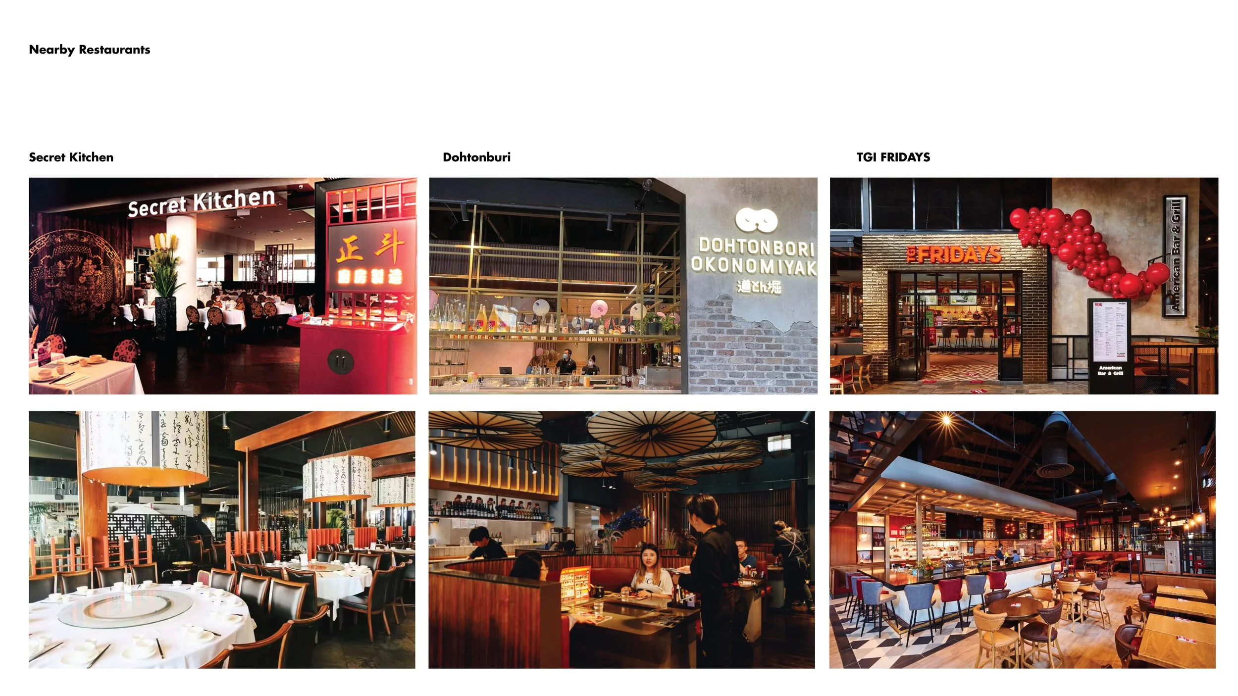
Nearby competitors within Westfield's food hall area

Brand mark and brand colour study of Asian shops that exist in Melbourne in 2019

Other Korean BBQ Competitors
Return brief to client
Target 01: Defining Yeosin's brand position in the food and hospitality market
Based on the research above, we believe that the best brand positioning for Yeosin is between premium and affordable to cater to their wide range demographic. The brand visually needs to be bold, simple, and contemporary to tackle the visual challenges that are presented by other restaurant competitors.
Target 02: A brand that evokes 'premium affordability'
Branding Goal— The brand needs to:
Look premium but not too exclusive and should attract middle-class customers who are looking for a once-in-a-while luxurious experience.
Evoke the mayhem and excitement of a hawker market in Asia. Customers come to Yeosin not just for the food but also to delight in a sensory and exciting experience of the restaurant.
Consistent and versatile across various brand touchpoints (logo, menu, signage system, packaging, uniform).

Concept Stage
Knowledge gained from the research stage are distilled into 2 concept design directions. By visually exploring different directions, we could begin to define one main direction that best met Sketch’s target market and needs to grow as a business in the built environment.
Art Direction 01: Flowing Embers
In Korean language, the term ‘Yeosin’ means embers. So, in liaison with Emma (the design director), I decided that we should stay true to the story behind the name and create an art direction that revolves around embers. Inspired by the dynamism and elegant colour palette of hot burning embers, we successfully created a brand identity that is unique to Yeosin representing a contemporary Korean barbeque experience. Using the embers as a starting point, we are highlighting the sense of excitement that comes from cooking with fire.

These are some of the visual moodboards that inspire this branding direction.

Taking an inspiration from hot flowing embers, we created a versatile brand pattern that will be used across Yeosin’s brand touchpoints & signage systems.

For the creation of the Yeosin logo, we were particularly inspired by the grid systems used in Korean seal stamps and Korean Hangul character.

Custom-made typefaces are also used for the Yeosin branding. We utilised lines with consistent width and thickness to imitate Korean Hangul (Korean characters) that is usually written in a grid system.
Art Direction 02: Hand Mark-making
In this direction, we are particularly intrigued by how hand-mark making can evoke a sense of bold elegance when combined with beautiful paper texture and a rich colour palette. These hand marks evoke the creativity necessary for balancing the distinctive flavours in Asian Fusion cuisine. Moreover, it visually reflects the charcoal elements used in a rich Korean BBQ cooking experience.

These are some of the visual moodboards that inspire this branding direction.

Taking inspiration from bold charcoal blocks typically used in cooking, we created a bold elegant logo paired with fluid lettering to represent the Yeosin brand.

We combined the use of bold hand-making patterns with fluid calligraphic lines to create a brand language that feels premium and of high-quality.

Brand Application on menu, coaster, and table mat.
At the end of the concept presentation, the client chose to move forward with Direction 01!
So, in this next step, I spearheaded the implementation of Art Direction 01 above across different media touchpoints such as packaging, menus, and uniforms. I have to thank two of my design colleagues, Norman and Anna (design colleagues), for their design inputs and also their collaborative work ethics as together we successfully created brand outputs that are versatile, consistent, and reflect Yeosin as a brand that is both premium and yet approachable and affordable.
Some of the final brand outputs can be seen below.
Final Art for the Printed Collateral
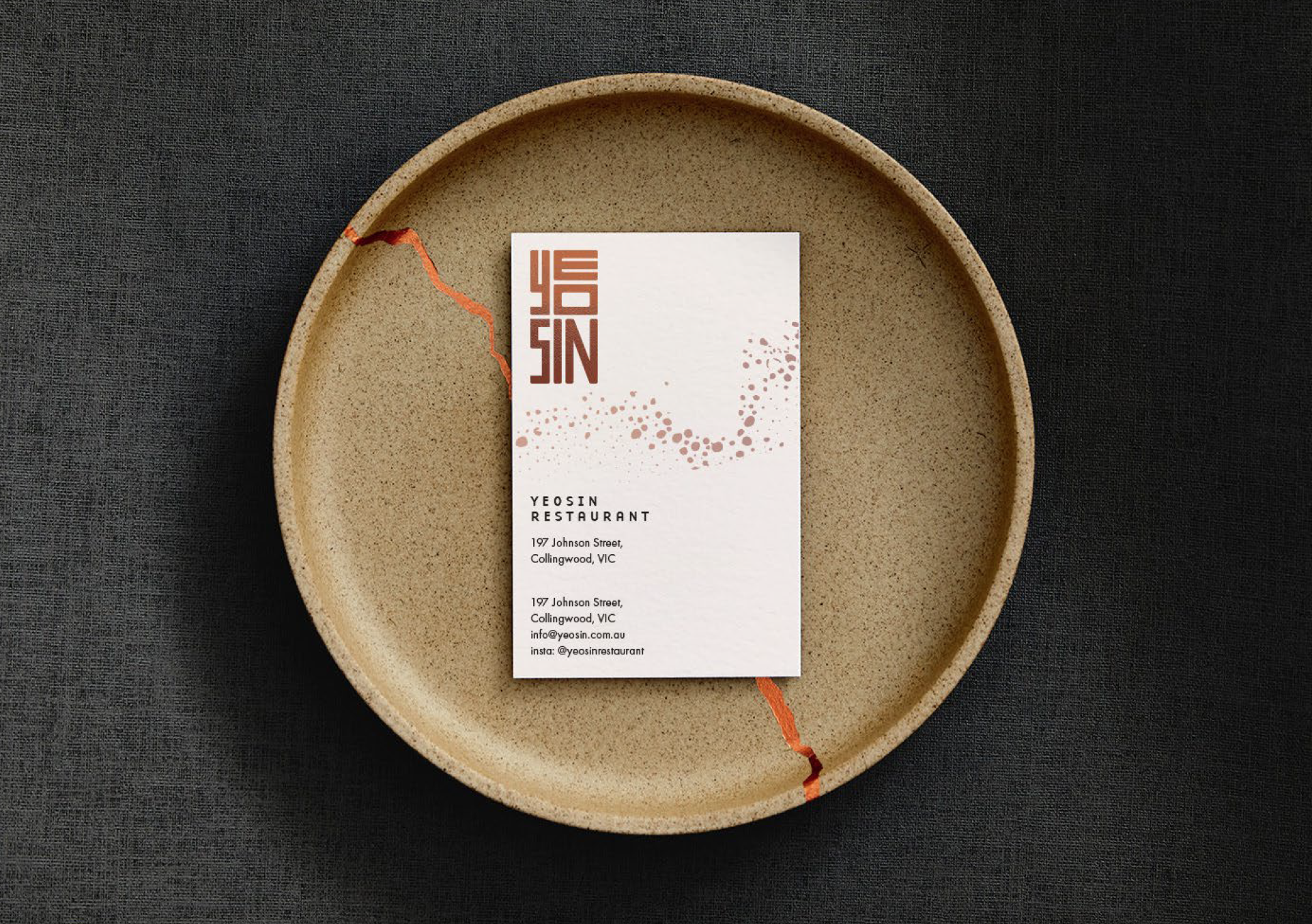
Business Card & Plate
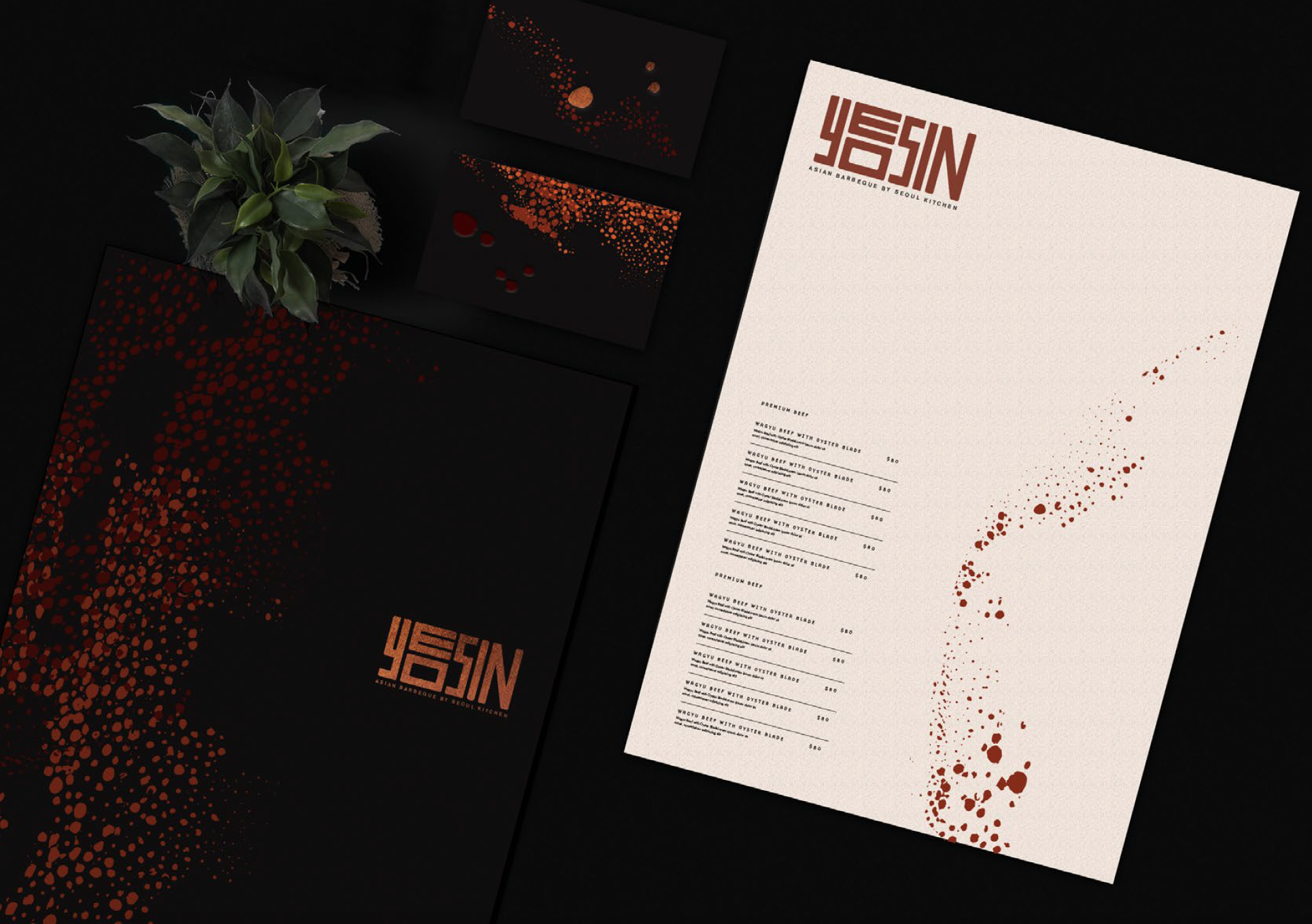
Menu
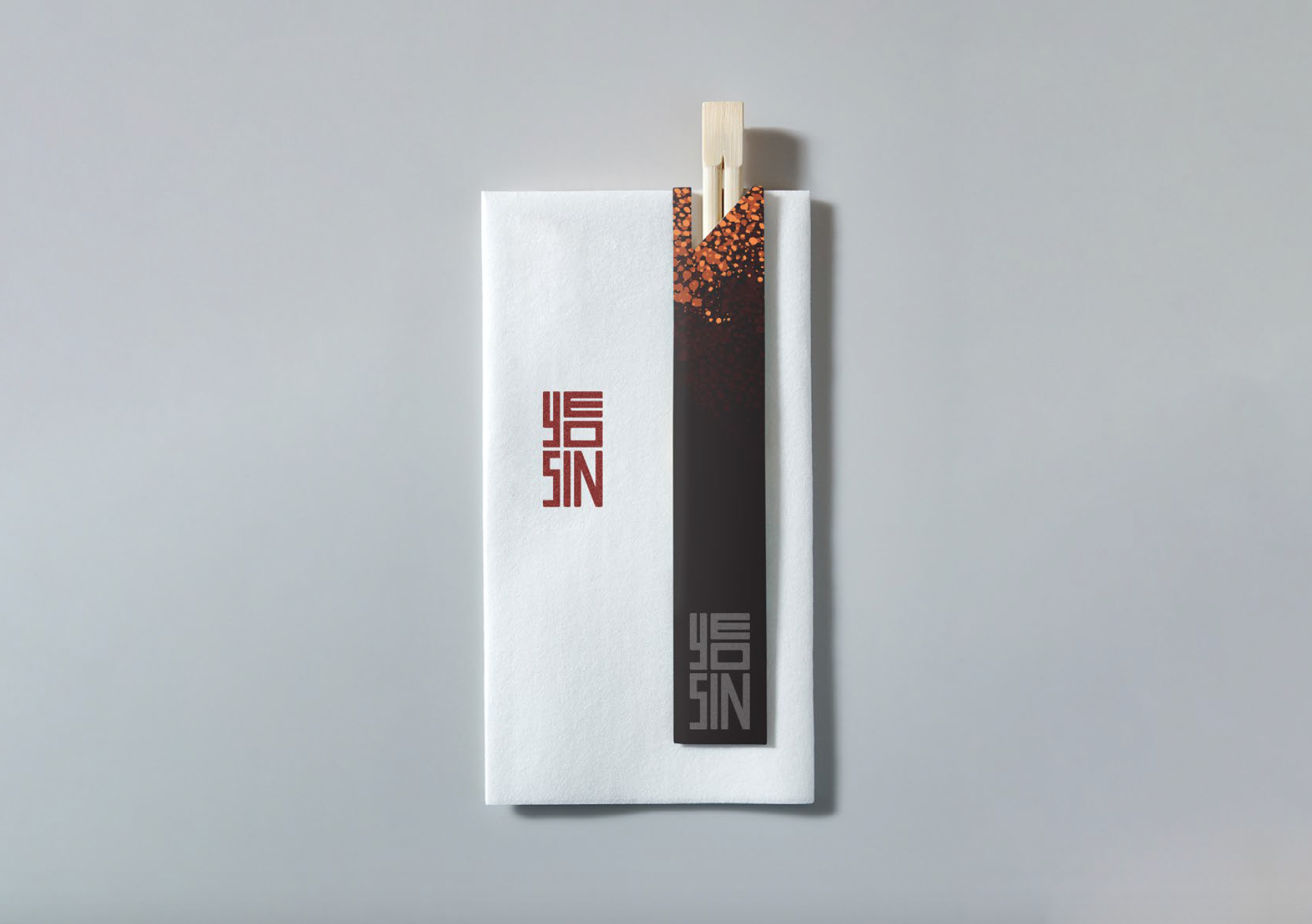
Napkin & Chopstick
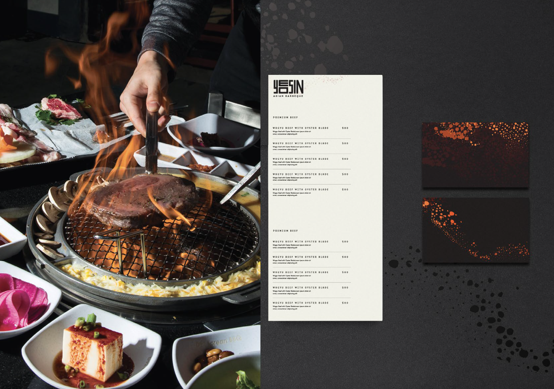
Menu & Business Cards
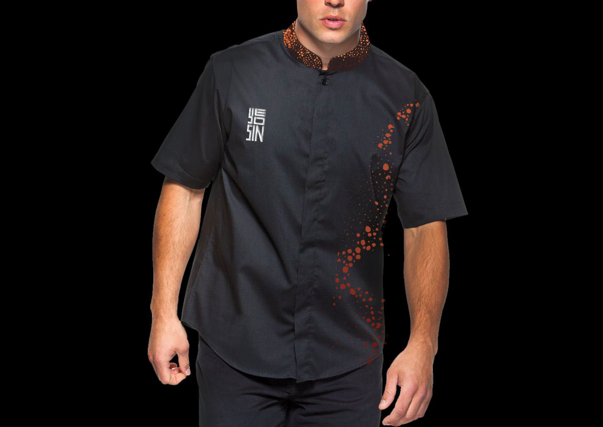
Uniform
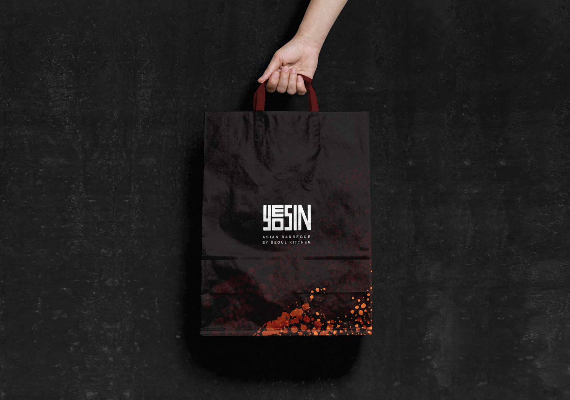
Takeaway bag
Once the brand outputs are sorted out, we collaborated with ArchitectsEAT, a Melbourne-based interior design studio, to develop a signage system and interior design for the restaurant. Initially, we had thrown away Art Direction 02 out the window. We throw it out because we feel that the branding direction feels a bit too exclusive and we want Yeosin to feel family-friendly as well. However, the team from ArchitectsEAT believed that the charcoal elements can be utilised and integrated into the restaurant space to create an exciting immersive experience.
So, we decided to try and combine both elements of embers and also charcoal into the signage and interior of the restaurant. Some of our creative solutions can be seen below.
Signage Solutions for the Restaurant Interior
Taking inspiration from our charcoal art direction, ArchitectsEAT proposed an idea to create an expansive ‘cave-like’ ceiling to create a sense of grand discovery. They were planning to use black timbers of various sizes to create depth and dimension in the ceiling space. This idea fitted well with Yeosin’s goal to create an exciting Asian dining experience where customers can experience a new interpretation of Korean BBQ.

Black timbers on ceiling.
To match this vision, we also decided to use black timber for the main signage at the front of the restaurant. We think the look of black-on-black can be quite interesting.

Signage on Elevation Drawing

Black Wood Signage

Signage Material

Signage on 3D Mockup
However, after further discussion, we decided that doing a black-on-black approach for the main shop signage may not be the best idea. The signage would still be hard to see from far away even when it is backlighted with an LED light. So, we decided to experiment with other materials as you can see below.


Final Signage System for the Restaurant Interior
In the end, we decided to experiment with some brass materials. The brass materials match well with the black timber on the ceiling as they have high contrast in colour and texture. As a cherry on the top, we added our brand pattern onto the ‘buk’ (Korean drums) on the restaurant’s walls. The pattern on the buk helps to tie the interior with the printed collaterals such as the menus and the restaurant’s packaging. The final solution for the main shop signage can be seen below.
Overall, the Yeosin client was very satisfied and happy with the final results of their print collaterals and signage system. We, as a team, successfully depict Yeosin Restaurant as a new Korean BBQ experience that is premium yet family-friendly to the local communities in Doncaster. Yeosin was launched in Westfield Doncaster mall in the beginning of 2020.

Final signage on application

Final Signage mockup

