Sketch Building Design
This project won a Silver Medal at the 2021 Melbourne Design Awards: Driven x Design
Category
Branding & Identity (rebrand), Digital Website, Signage Design & Photography Direction
Sector
Built Environment
My Role
Lead Designer
Collaborators
— Sash F. (Creative Director)
— Indi M. (Marketing Team)
— Coire J. (Web Developer)
A little bit about Sketch.
-
Sketch is a boutique residential building design & development consultancy that approaches every built project with a firm commitment to respect what makes it unique. Sketch Building Design was established in 2006 by co-directors Darrin Albert and Andrew Brown at Elsternwick, Melbourne.
-
Their services encompass: design development, concept design, space planning, master planning, building permit & construction document, town planning permit documentation, town planning administrative & submission, 3D visualisation, energy rating reports, drafting service, building supervision, independent site inspections, and builder recommendation.
-
During our brand workshop, we use car exercises (see image below) to extract brand values that are important to the company:
1. Respect the client, respect the building site
2. First-class professionalism & skills
3. Passionate collective team
4. Provide practical building design solutions
5. Approachable & trustworthy
Stakeholder Map
Prior to starting this project, Sash (Creative Director), Indi (Marketing Team), and I have a brief chat with Andrew and Darrin (Sketch Directors) to get a better understanding of who their target audiences are. We then came up with this stakeholder map, which helps us to understand the primary users of the brand. From this, we start to understand who will be interacting with the brand touchpoints and then target accordingly.


Brand Audit
I conducted in-depth brand research & audit to analyse Sketch’s SWOT (Strengths, Weaknesses, Threats, and Opportunities) & current brand visuals, and competitors. The outcome of my research shows that there are some significant challenges that needed to be tackled in the re-branding process to ensure that Sketch’s brand resonates with its target market. These challenges are listed below.
-

Visual branding does not represent first-class quality & professionalism
Sketch has a proven track record of experience and skills in the built industry. They also have a strong portfolio that represents high skills and professionalism in building design. However, the logo & visual language used throughout their brand touchpoints is struggling to make an impact. The brand language can easily get lost in a highly competitive built market.
-

Colour palette does not reflect modernity in use of technology
The shades of grey can possibly be utilised in the new re-branding. However, the bright red does not evoke a sense of modernity or innovation especially when paired with the traditional rigid logo.
The chosen colour palette does not evoke a sense of elegance which may create a hindrance as Sketch is trying to appeal to a more up-market target audience. -

Photos need to have more human aspect
The photography direction of their project is quite intriguing and appealing. However, chosen imageries need to be in HD quality so that it doesn't get pixelated when placed on websites (main brand touchpoint) and other large-scale collaterals. Additionally, there needs to be an insight into the human aspect of the business— the builders, the team members, and the building & design processes behind each project. Human-based photos can make the business feels more relatable, approachable, and less rigid.
-

Website needs to be versatile & user-friendly when accessed from various devices
The website does not convey the work process of the company well. Font choices in the website is not elegant or modern. Page style needs consistency. Website needs to be easily navigated by users. Currently, there are a lot of scale/sizing and layout issues when the website is being accessed from different devices.
-

Competitors who offer similar services have strong and better visual identities
Many of Sketch's competitors (one of them is Canny) have strong brand identity & sleek website that are not only appealing but also user friendly and easy to navigate. This is a very important aspect to consider as website is the primary brand touch point in the built environment.
-

Sketch often gets mistaken as a builder business and not a building design company
Due to their visual branding, Sketch's target audience often misinterpret the company as a builder company and not a built design company. The Sketch founders wanted to change this mindset as they are originally designers and not builders. This issue requires a new brand repositioning so that Sketch can compete with its existing and potential new competitors.
Return brief to client
Target 01: Redefining Sketch's brand position in the built market
After taking into consideration the challenges above, we proposed to the Sketch founder a new brand positioning in the built environment. The Sketch owners agreed that their current branding visually looks rigid and traditional, which makes it hard for them to reach a more up-class market. Whereas their competitors, such as Canny, might give off an 'exclusive' vibe to their existing mid-class target audience. Hence, we decided that the best brand positioning for the future Sketch brand is somewhere in between approachable and exclusive. In this way, Sketch can still continue to nurture their smaller and mid-class clients while expanding their ventures to serve upper-class clients.
Target 02: Approachable & contemporary brand identity & website design
These are the branding goal we set up for Sketch. The brand needs to:
Be approachable and appealing to existing & new customers.
Convey a look and feel of credibility and trustworthiness.
Have a professional tone of voice.
Represent a wide range of experience & consistency toward quality.
Be a combination of approachability and contemporary elegance (but not exclusive).
Represent Sketch as a company that utilises modern technology in providing solutions.
Represent Sketch as a built design company and not just a builder/built development company.
Evoke easy & clear communication between the Sketch team and the target audiences.
Consistent and versatile across various brand touchpoints (logo, branding language, and website design).

Concept Stage
Knowledge gained from the research stage are distilled into 2 concept design directions. By visually exploring different directions, we could begin to define one main direction that best met Sketch’s target market and needs to grow as a business in the built environment.
Art Direction 01: Construction through the play of light and shadow
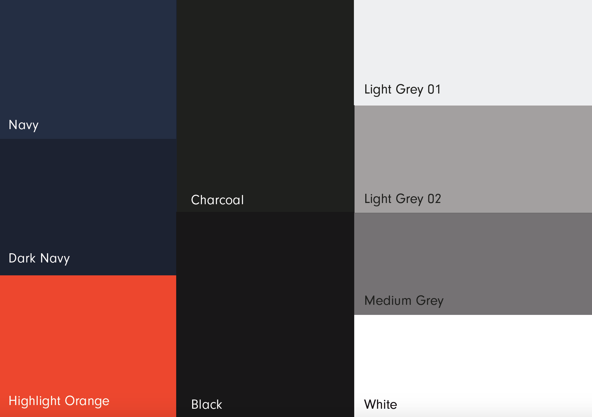
This art direction is primarily inspired by Modernist architecture and architects, such as Alvar Aalto, whose works often consist of sharp edges & dynamic angles. I was particularly intrigued by the shapes that were created as sunlight hits the walls of these modernist buildings. By taking a focus on functionality and streamlined shapes, I aim to bring a sense of credibility and professionality to the new Sketch brand. The chosen font showcases Sketch as a dependable well-oiled machine with strong detail and focus on design thinking. For this direction, I chose to expand Sketch’s old colour palette by adding a sandstone colour and darker shades of greys (such as charcoal and graphite). These neutral colours help to represent Sketch as a brand that embraces modern technology and contemporary approaches in the built environment.

Moodboard Inspiration

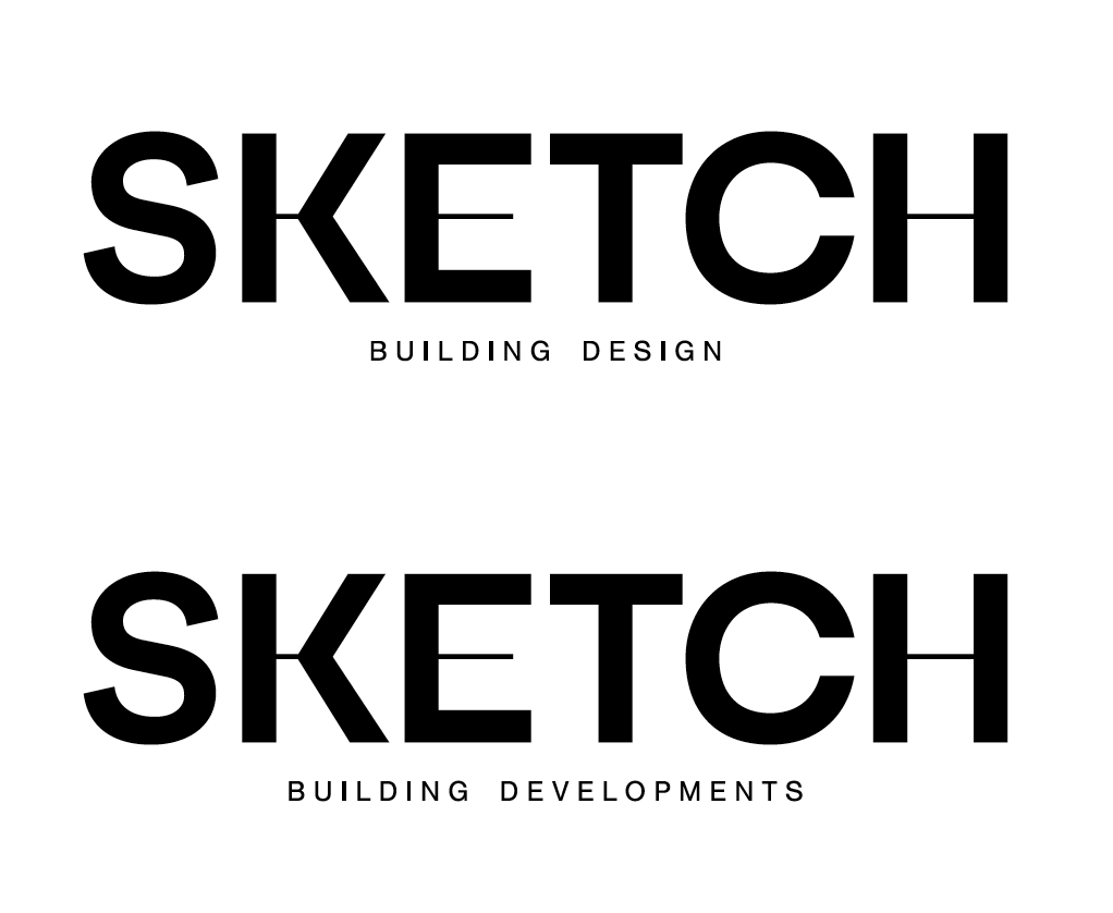
Logo

Logo Sub-brand

Logo Grid

Logo on colored backgrounds

Brand colour

Brand Language

Brand Typeface

Business Card

Email Signature

Letterhead

Folder

Publication

Publication

Website
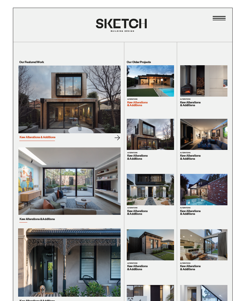
Website
Art Direction 02: Construction through draftsmanship
Sketch has always been a company that is transparent and thorough in communicating with their client about their working process. Inspired by architecture blueprints (the cornerstone and starting point of any built project), I aim to evoke Sketch's transparency and approachable aspects to their clients through the use of grid and line works. The use of thick and thin fonts is to represent Sketch as a company that possesses high credibility and adaptability in taking on a wide array of built projects.

Moodboard Inspiration

Brand Language

Logo Lockup Variation

Logo Grid

Logo on different colored backgrounds
Brand Colour

Brand Typeface

Business Card

Email Signature

Folder

A4 Publication

Letterhead

Van decal

Website

Website
The client has chosen to go forward with Direction 01. There are some tiny bits-n-pieces from Direction 02 that the client loves, such as the “Highlight Orange” colour and the Nimbus Sans typeface. As the client is very satisfied with the branding and website design, we move forward to the Design Development Stage. There are no major issues in the brand identity & print collateral side of things; thus, the design can go straight into production (the final product can be seen below).
Final Branding
All the key goals have been achieved. Our Sketch client is very happy & satisfied with the finished product (see images below). As a result, they decided to expand the design scope—they want us to create signage, establish a new process diagram and also direct the photography direction for their new website. From a business perspective, we ended up bringing more profitability to the studio and returning clientele. From a design perspective, the number of hours and hard work that goes into this design helped our studio to achieve a Silver Medal in the Melbourne Design Awards 2021.
Brand Identity
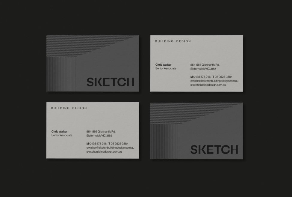
Business Card
Business Card
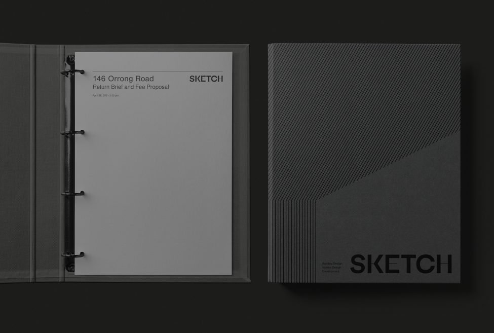
A4 Folder
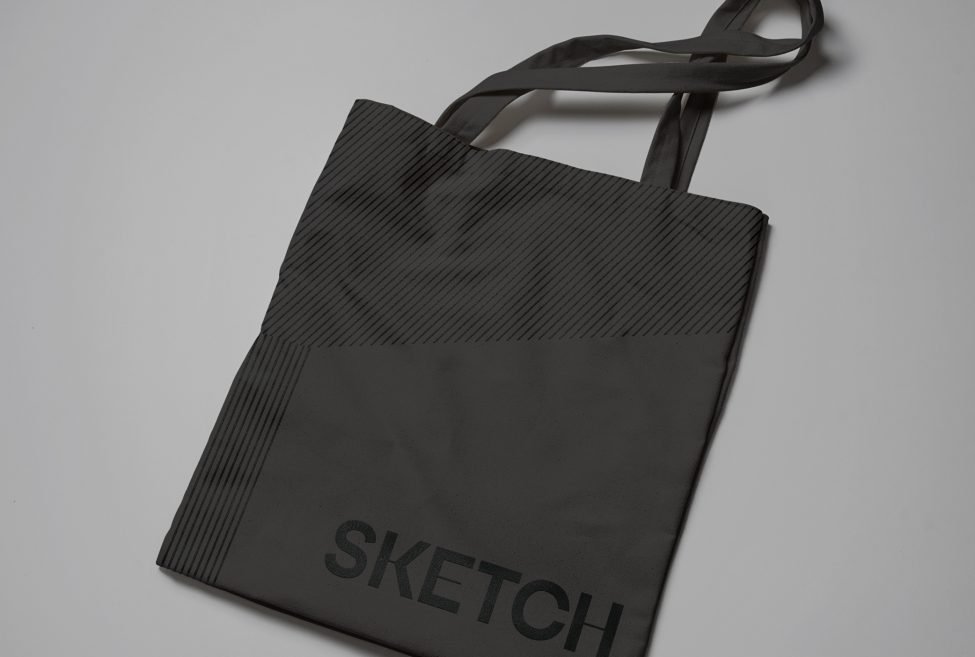
Totebag
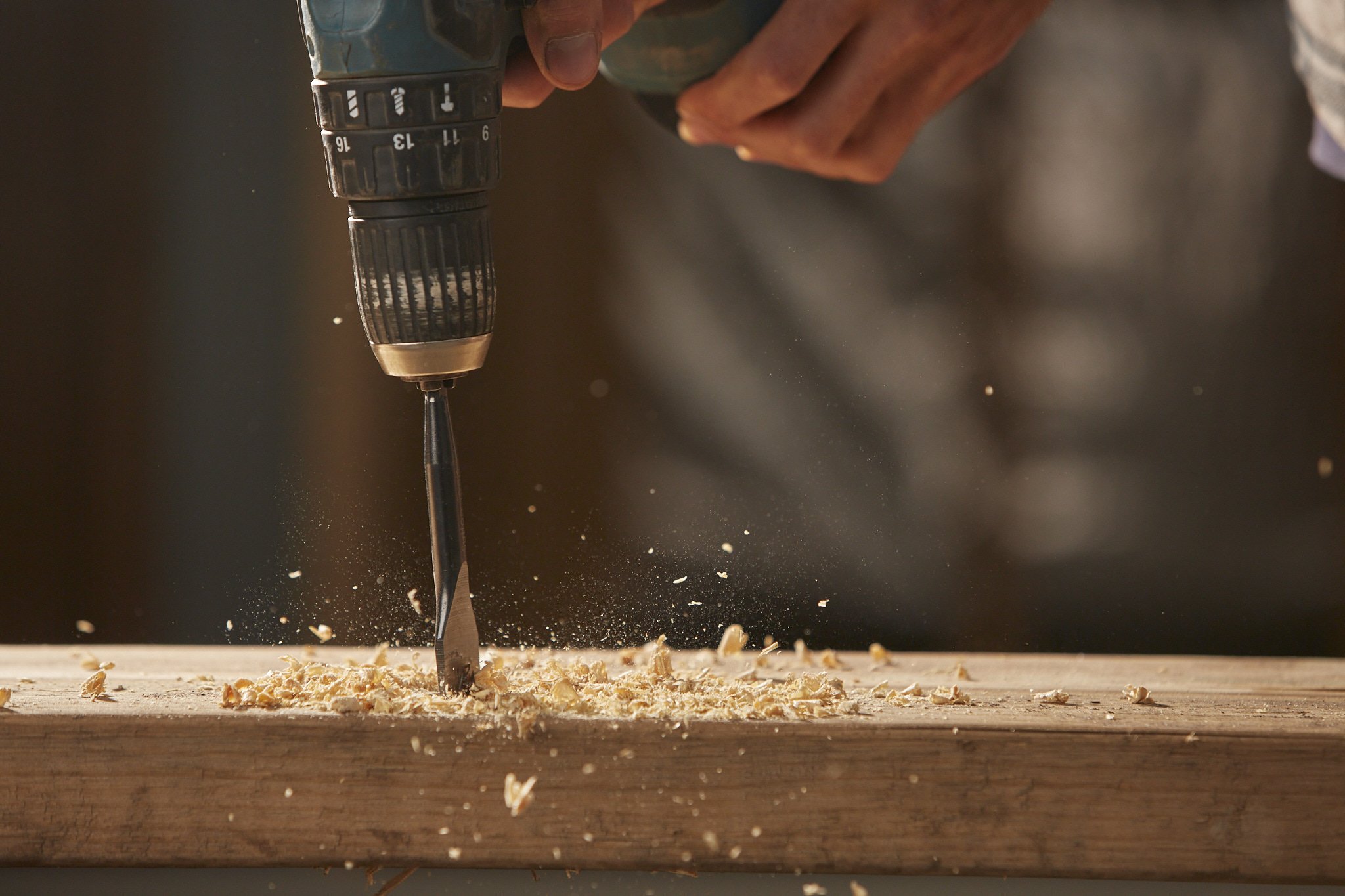
Photography direction
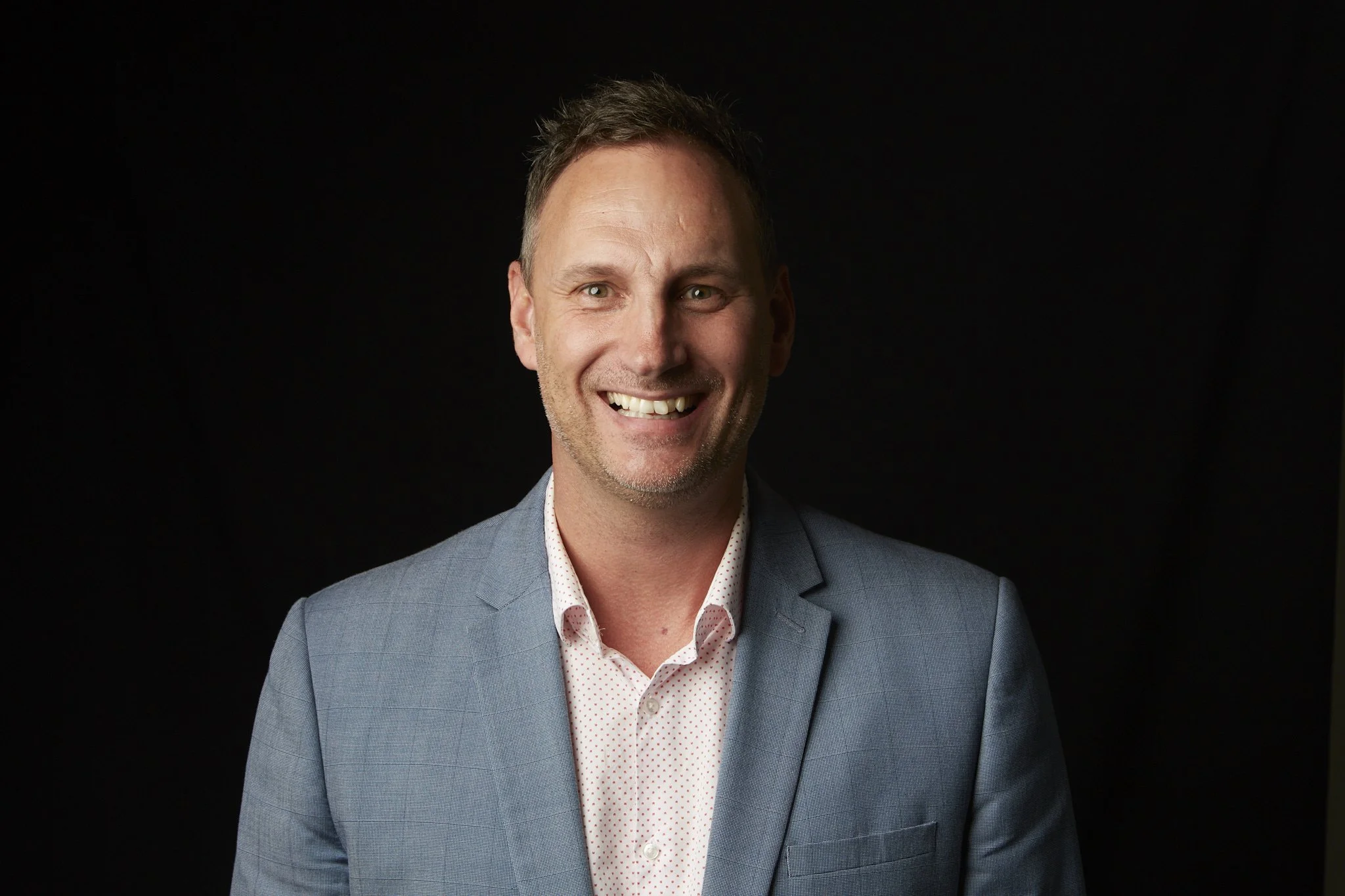
Photography direction
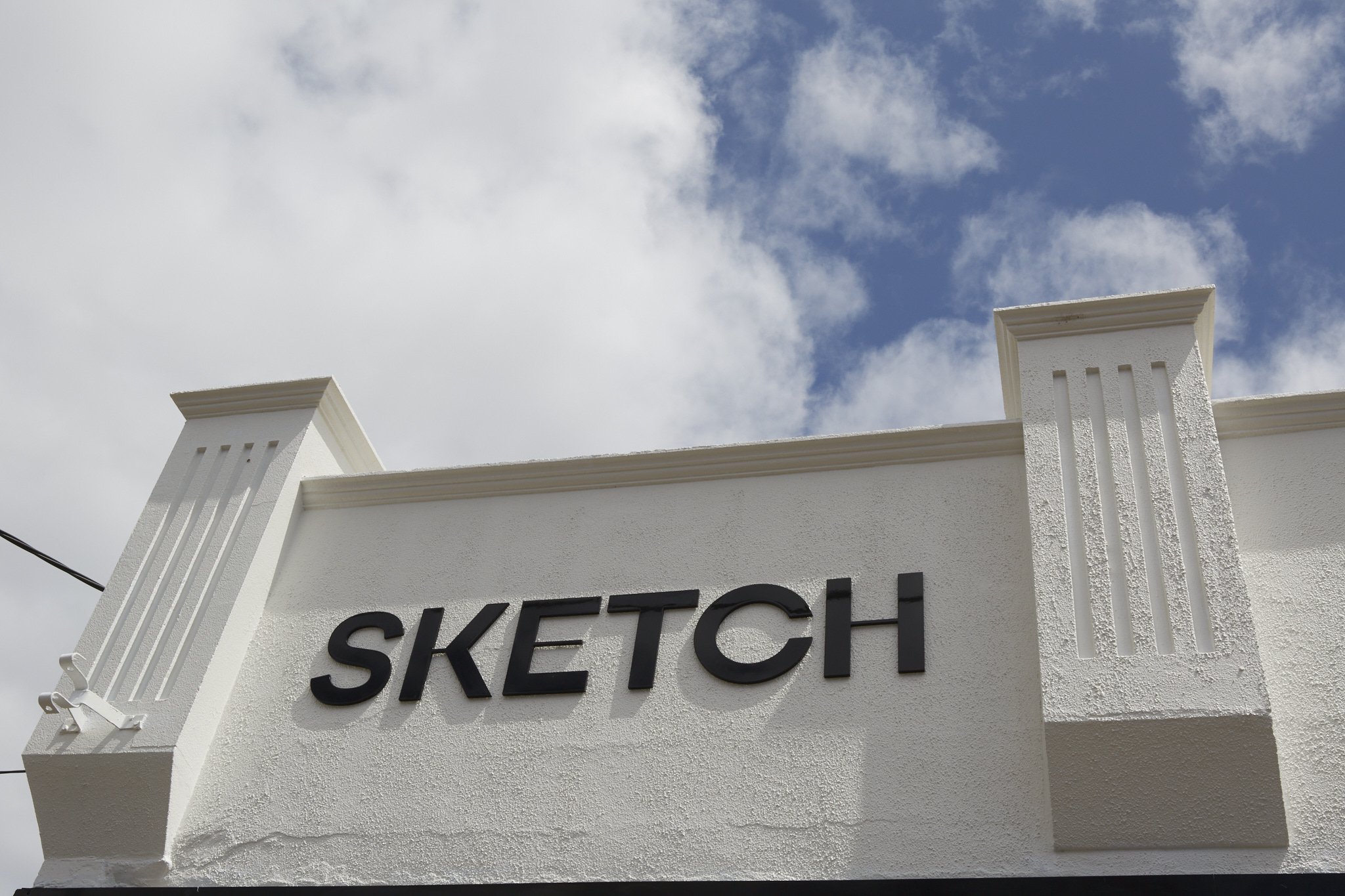
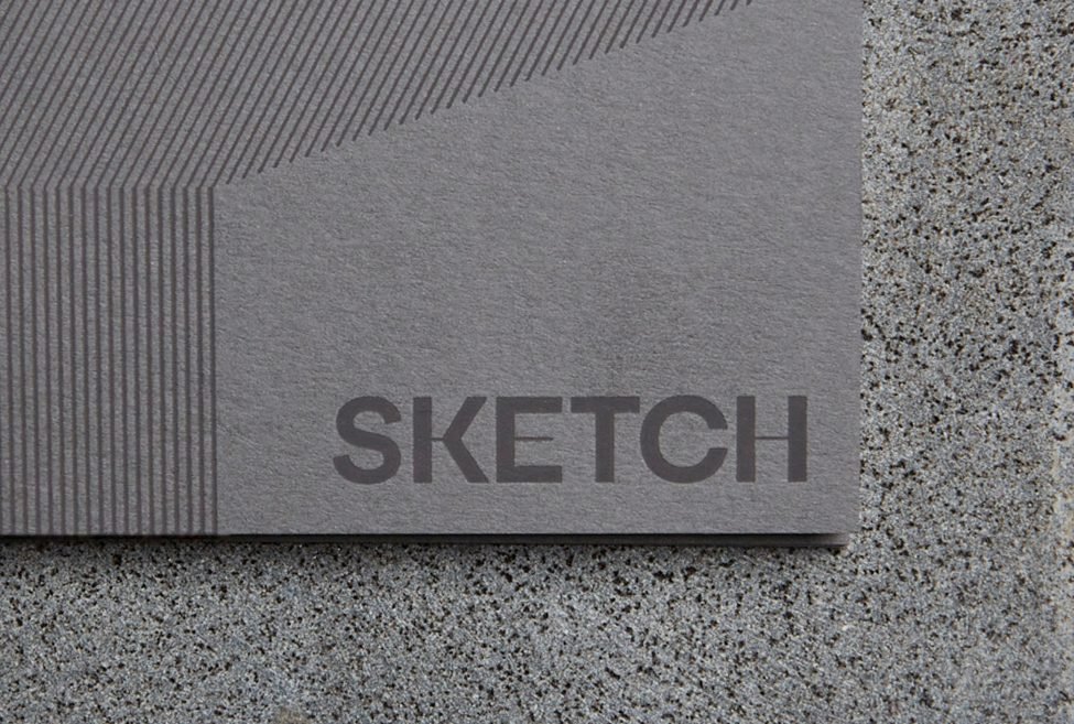
Signage
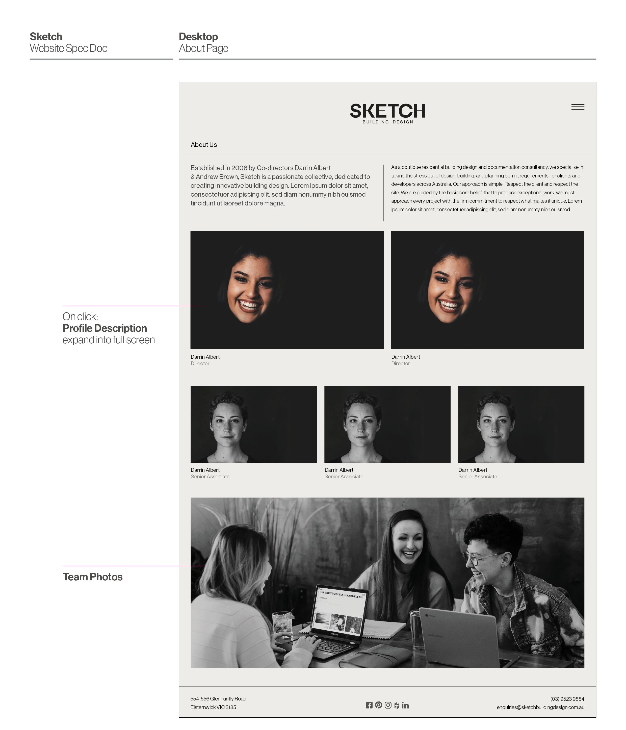
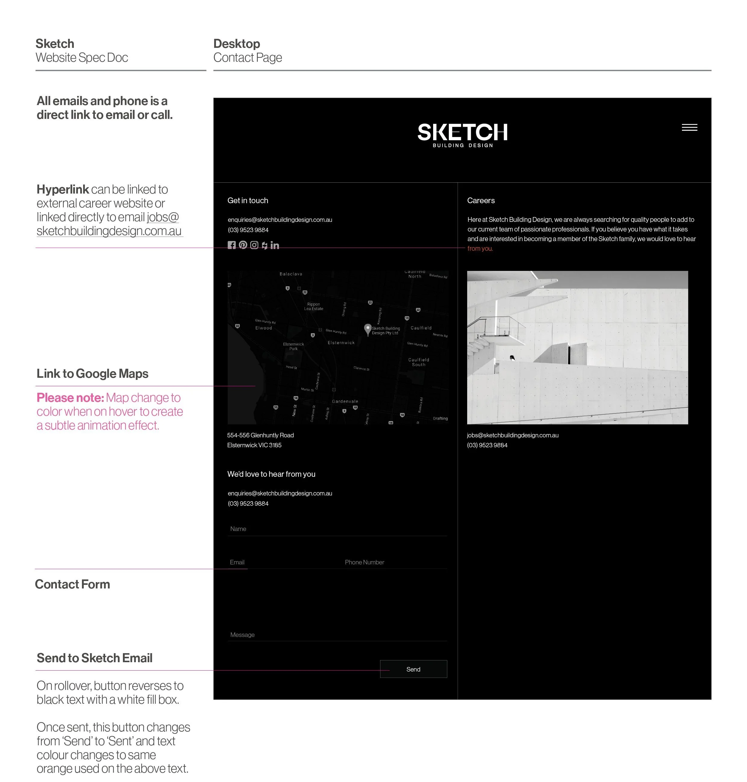
Website Design
Branding visuals from the final concept are then extended into the website visuals. We utilised a Modernist idea that focuses on the use of a streamlined grid and functionality to create a website that is visually elegant, minimal, and straight-forward.
In relation to web development, I cross-collaborated with Coire, an external web developer, to build the Sketch website from the ground up. I handled the front-end side of things, whereas Coire and his team dealt with the back-end coding. Listed below were some of the back-and-forth problem-solving, idea-bouncing, and critical thinking that occurred between Coire and me as we attempted to reach Sketch’s website goals.
WEBSITE DEVELOPMENT GOAL 1
Evoke easy communication to Sketch’s clients
Problem: It is crucial for the website to evoke Sketch’s core values such as first-class professionalism, credibility, practicality, and trustworthiness. As the brand’s main touchpoint, the website needs to be user-friendly and easy to navigate.
Solution:
For easy navigation, a sitemap is developed to help organise larger information about Sketch into smaller targeted page groups.

To create design & branding consistency, we problem-solved and create a detailed outline as to what type of transitions is needed for each website element from buttons all the way to image and text transitions. This design requirements are communicated to our external web developer using a website specification document as per below.


WEBSITE DEVELOPMENT GOAL 2
Fluidity
Problem: With the rising popularity of smartphones and digital tablets (on top of computers/laptops), it is of the utmost importance that Sketch’s new website is compatible with screens of various sizes. We can’t afford Sketch to lose online users due to poor design and usability. So, web fluidity is one of the top goals we have on our web development list as it also affects the user-friendliness aspect of a website.
Solution:
Utilising fluid grids.
By utilising fluid grid principalities, we break down the width of the web pages into several equally sized and spaced columns.
Page content is placed according to these columns. When the viewport (the user’s visible area of a web page) expands horizontally, each fluid column will expand accordingly, as does the content within the columns. Image sizes and font sizes would also be adjusted in relation to the user’s viewport; thus, every paragraph should still be readable even when accessed on small-sized screens.

WEBSITE DEVELOPMENT GOAL 3
Adaptivity across multiple devices
Problem: To reach fluidity and website responsiveness, it is important for the front-end design to adapt to multiple screen sizes. There is more going on here than just shrinking the widths of elements, though that is part of the design as well. But also, the content itself should change!
Solution:
Create separate UI designs for oversized desktops, desktops, tablets (horizontal & vertical view), and smartphones.
By providing multiple separate website layouts for specific screen widths, our goal is to cater to multiple specific devices.
This will increase the adaptivity of the website. We don’t need to worry about poor user experience if we took account any device users may use.
I have to thank Coire and his team on this one, as they help me achieve adaptive web design by using media queries, a feature of CSS (Cascading Style Sheets) that detects properties of a user’s device including their screen dimensions. The media query reads the screen size, then selects the best-suited layout from multiple layout options that I have provided for him.

Together with Coire, we also set up different breakpoints for each web page design.
Breakpoints are pixel values that a developer/designer can define in CSS. When a responsive website reaches those pixel values, a transformation (such as the one detailed in the image above) occurs so that the website offers an optimal user experience. Notice the effects of these breakpoints (in the video below) as users shrink or expand their browser windows.
After this, we did multiple cross-platform compatibility testing by opening the website from multiple devices with various screen sizes to ensure that the website is responsive and functioning well. Then, the website is ready to launch!
You can see Sketch’s final website here.
(Please note that the website was done and handed over to Sketch in 2019.
There will be some changes made independently by Sketch themselves and potentially by other designers/web developers since then.)