Melbourne Uni Sports
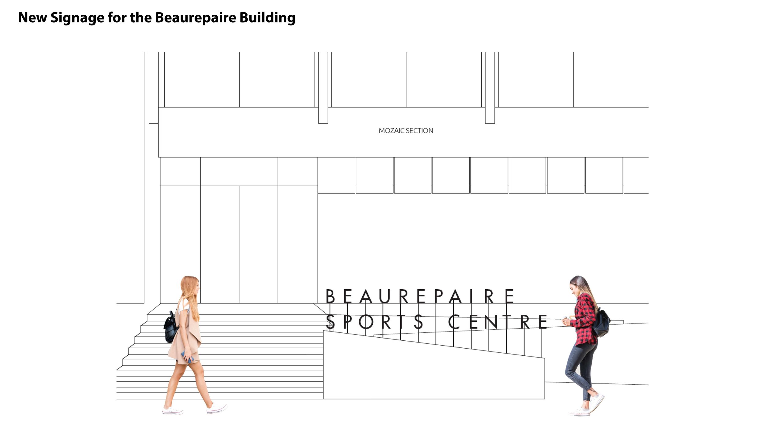
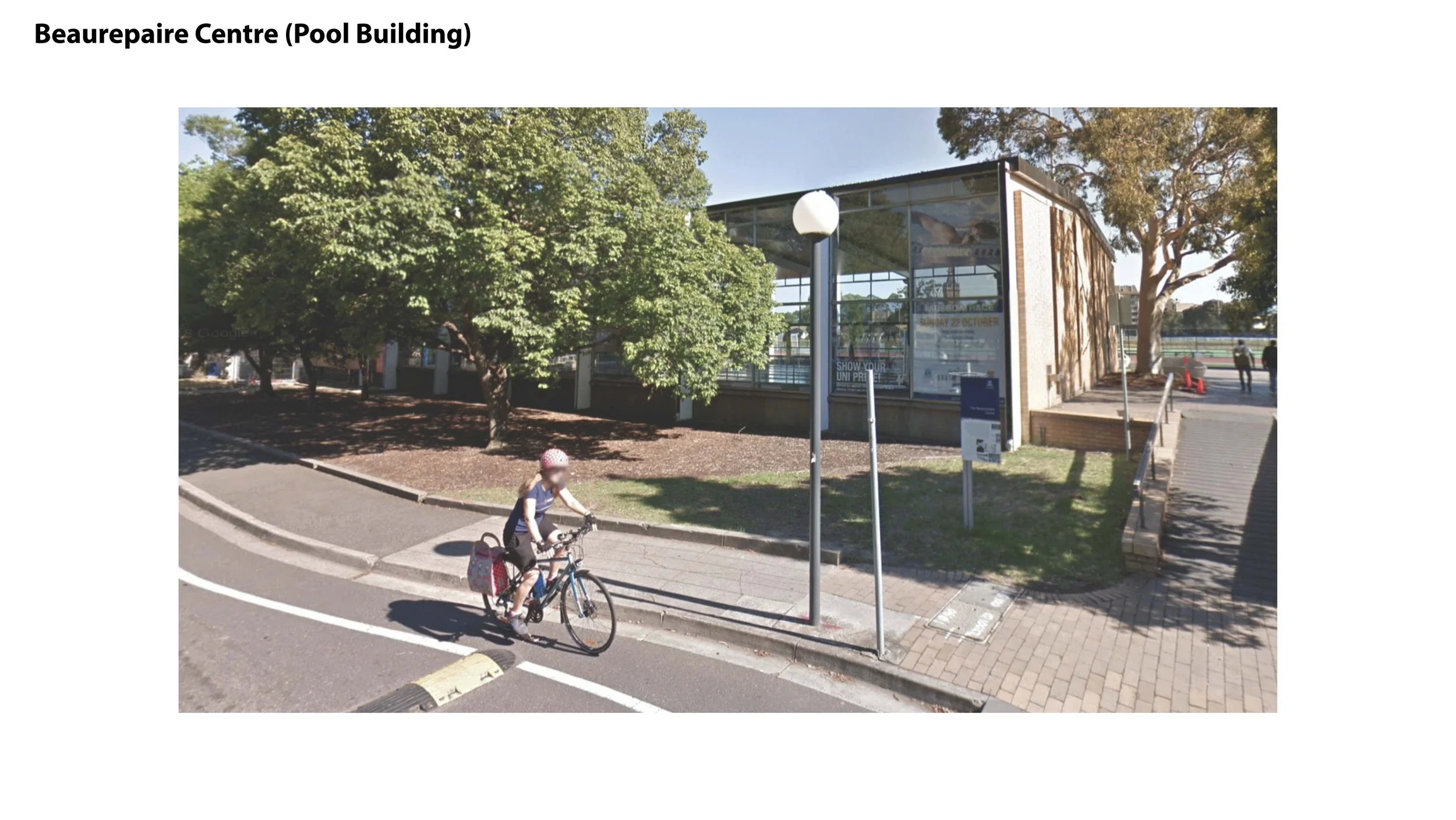
Melbourne University, the second oldest in Australia and the oldest in Victoria, underwent a rebranding in 2018 to appeal more to millennials. The current project involves designing a contemporary and dynamic wayfinding system for their sports facilities: the Beaurepaire Building and the Main Sports Building. Given that most of the buildings are heritage-listed structures, painting new colours on the walls is not permitted. Our main goal is to devise a way to incorporate a modern, contemporary design while still respecting and preserving the buildings' historical significance. As part of the wayfinding solution, sporty illustrative graphics and sleek metal materials are being integrated into the wayfinding system to create a space that feels dynamic, youthful, and contemporary.
Category
Signage Wayfinding
Sector
Education, Sports
Illustrative Athletes for Wayfinding
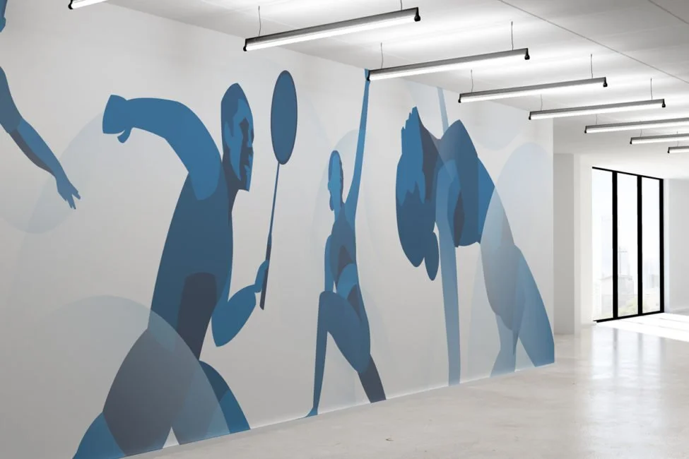
Google images of athletes were used to develop this illustration style. The interplay of light and shadow on the body of a sports player was observed to create the design. The final result of this experimentation is an illustration style that is minimalistic, sleek, and bold in its approach. Curvy lines are incorporated across the illustration to create a sense of active movement and dynamism. These illustrations are primarily applied to flag banners and wall murals in the Melbourne Uni Main Sports Building.
Illustrative Collages of Melbourne Uni Student Athletes
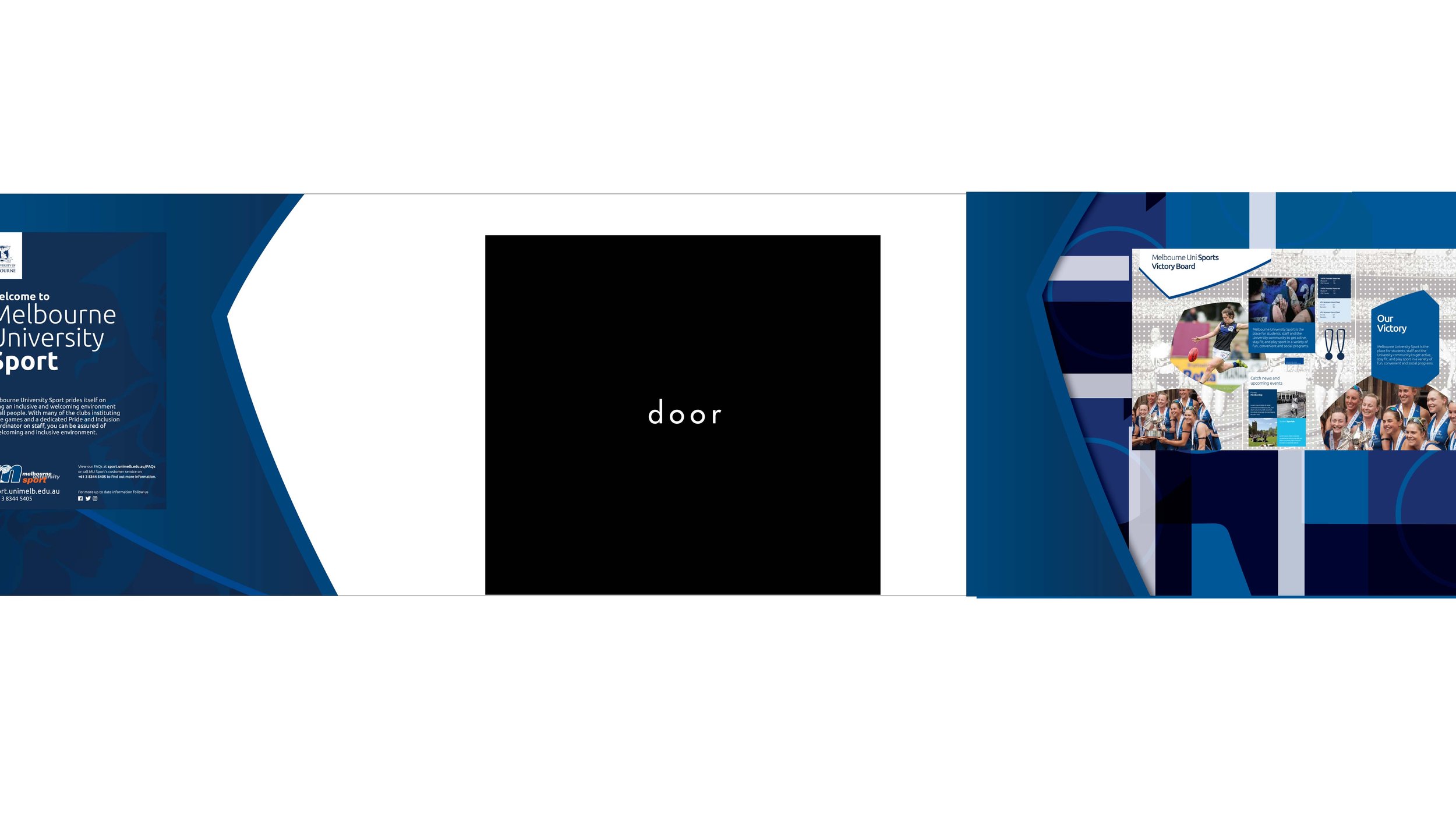
We also utilised the art of collage to bring to life a raw story of sportsmanships amongst student-athletes. This illustration style utilises a series of photos of Melbourne Uni athletes in various scenes, such as laughing with teammates and celebrating victories. We believe these images evoke a genuine sense of community and belonging, inspiring students as they walk through the hallways to take pride in their university and peers. This artwork is displayed on the info cabinet wall and the main entrance foyer of the Melbourne Uni Main Sports Building.
Wayfinding System in Application
Our goal was to refresh the appearance of the sports buildings without altering or renovating the existing walls or windows. To achieve this, we chose to apply sleek and modern materials over the old surfaces, such as powder-coated steel and duo-tone vinyl decals. This approach allowed us to develop a new wayfinding system that conveys a sense of boldness and sportsmanship.
Furthermore, the light blue colour palette was selected to update the university's traditional colours, providing the brand with a more versatile range of hues. At the same time, the dark blue colour maintains visual consistency with the university's original branding. This colour palette is applied across different wayfinding elements, including banners and wall murals.
For the Main Sports Building, we designed a seamless wayfinding experience that extends from the main entrance to the squash court. The blue walls are intended to draw visitors into their sports journey right from the entrance. At the entrance foyer, visitors are welcomed with a wall of warm messages from the Melbourne University Sport team. Visitors then continue along the info cabinet wall, which highlights the achievements of fellow student-athletes. At the end of the cabinet wall, visitors passes a long hallway of athlete murals, setting the stage for their chosen sports activities.

Long Hallway

Long Hallway

Wall beside Info Cabinet

Info Cabinet Wall & Entrance Foyer

Main Entrance


