Shin’s Table
Nongshim, a well-known Korean ramyun brand, runs an annual marketing campaign to boost sales. In early 2024, they planned an immersive marketing campaign featuring a pop-up restaurant to promote their six main ramyun products, known as the Shin Ramyun series. The pop-up restaurant, named Shin’s Table, was open for just two weeks in July 2024 at Oxford Village, Sydney.
The creative vision is to immerse customers in a Korean noodle-themed store experience where they can enjoy a meal and shop for Shin products and merchandise. Given Nongshim's globally recognised branding visuals, we must ensure that their established brand identity is seamlessly incorporated into the pop-up space. At the same time, we need to introduce a fresh, dynamic, and eye-catching design to create excitement and attract attention for the campaign.
To create something truly buzzworthy, we knew we had to embrace the unusual and unconventional. The final visual concept combines Nongshim’s original branding with elements from Pop art movements, vintage Korean posters, and films. Designed to be bold and striking, the placemaking visuals aim to capture the attention of passersby, inspire social media sharing, and generate buzz to elevate the Nongshim brand & campaign.
Along with the placemaking visuals, we also created a complete branding identity and language for Shin’s Table collateral.
Category
Branding & Pop-up Experience Placemaking
Sector
Food & Hospitality
Role
Lead Designer
Collaborators
Sam Heiligers (Project Manager & Producer)
Frank Li (Supervisor)
Shinsuke Nakayama (Web Developer)
Aidan Kwon (Videographer/Animator)
Noodle Linework to Expand Pre-existing Brand Language
To bring a fresh and fun twist to Shin’s Table branding, we aimed to create eye-catching visuals that highlight Nongshim’s core product: ramyun. We crafted a series of noodle linework illustrations to capture the playful and dynamic nature of noodles. Working with Frank Li, we experimented with the swirling, wavy characteristics of ramyun to make our illustrations truly reflect Nongshim’s product.
This year, Nongshim has been using emojis to express their slogan, "Everybody Loves Shin," showcasing how their noodles bring people together through shared enjoyment. We saw that this message would resonate strongly with Nongshim’s audience, so we decided to blend these emojis into the Shin’s Table visuals.
Branding Application for Shin’s Table Collateral
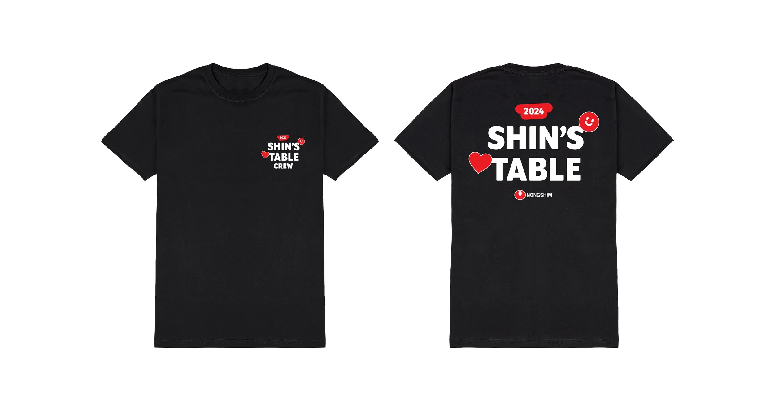
Staff T-shirt
Menu
Restaurant’s signage
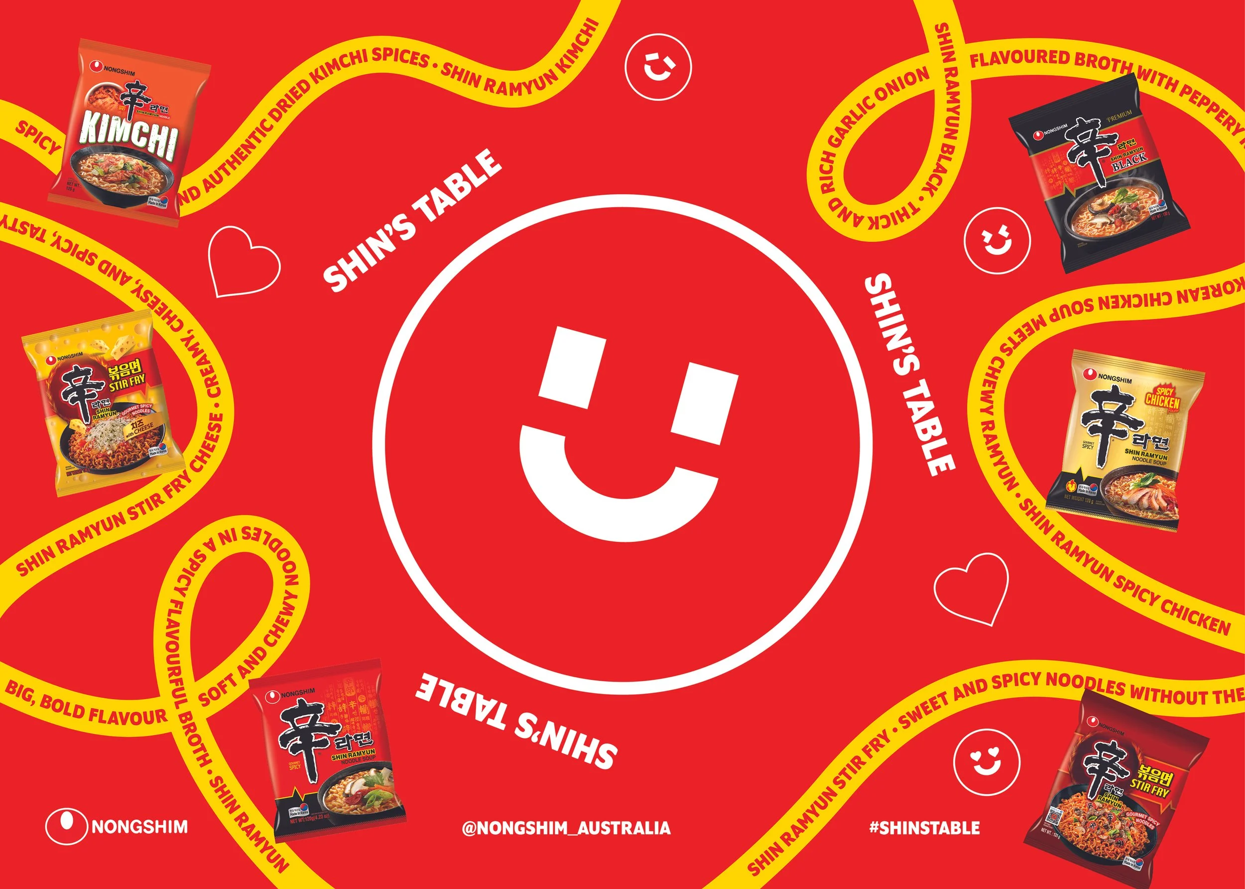
Tablemat
Shin’s Table Placemaking Planning
We want the Shin’s Table store to have a contemporary and stylish atmosphere to attract younger adults, but we also want to infuse the space with touches of Korean culture to honour Nongshim Ramyun's Korean roots. The key sources of inspiration for the space include Andy Warhol’s Pop Art, the Korean convenience store depicted in the Kim’s Convenience film series, and vintage 1950s/80s Korean propaganda posters.
Our vision involves dividing the store into two separate sections: a dining area where customers can enjoy noodles with friends, and a photo zone where they can take selfies and buy merchandise (see the floorplan).
Giant Poster Wall for Dining Area
We wanted the placemaking visuals to make a bold impression, compelling passersby to stop and explore the store. We also expect customers to snap pictures and selfies during their visit, so we ensured that every angle offers a captivating backdrop. The space is designed to be visually appealing from all directions and Instagram-worthy to spark excitement about the Shin’s Table campaign.
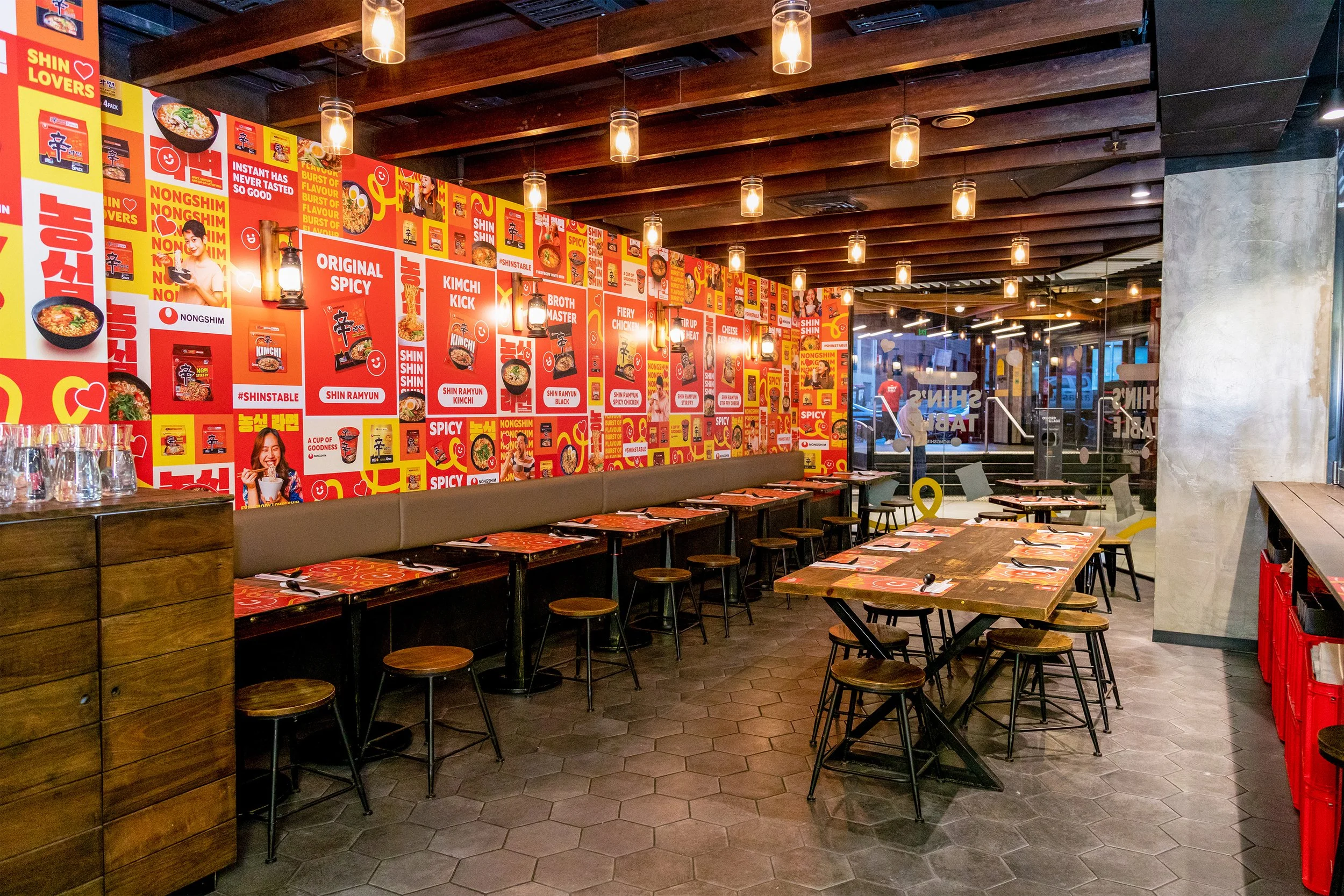
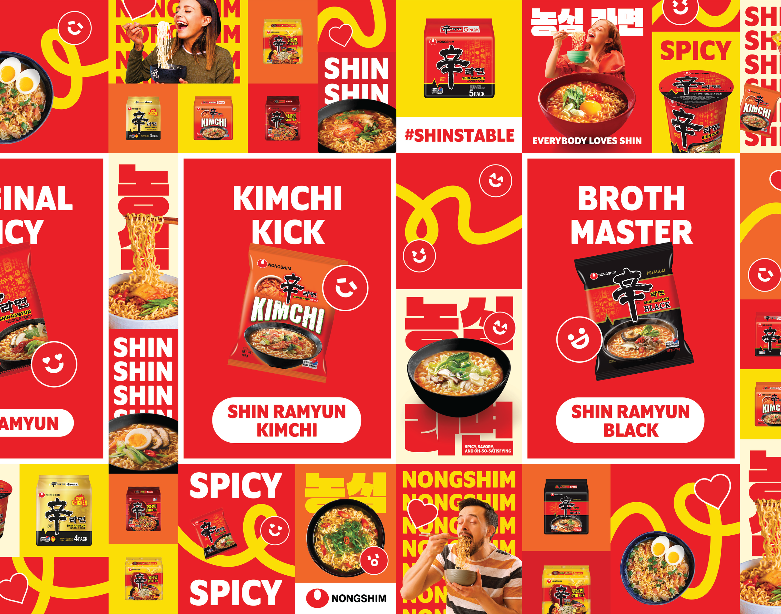
Inspired by Korean propaganda posters, we designed a series of posters featuring bold typography and vibrant colours, along with lively images of people enjoying a bowl of noodles. This captures Nongshim’s message that everyone loves Shin Ramyun. To add a playful element, we incorporated noodle linework from the branding. We also drew on Warhol’s use of bold colours and grid patterns, applying these concepts to create a large poster wall that serves as the central visual backdrop in Shin’s Table dining area.

Dine-in Area Wall
Dine-in Area Wall

Dine-in Area Wall

Dine-in Area Wall
Red on Red Crate Wall for Photozone
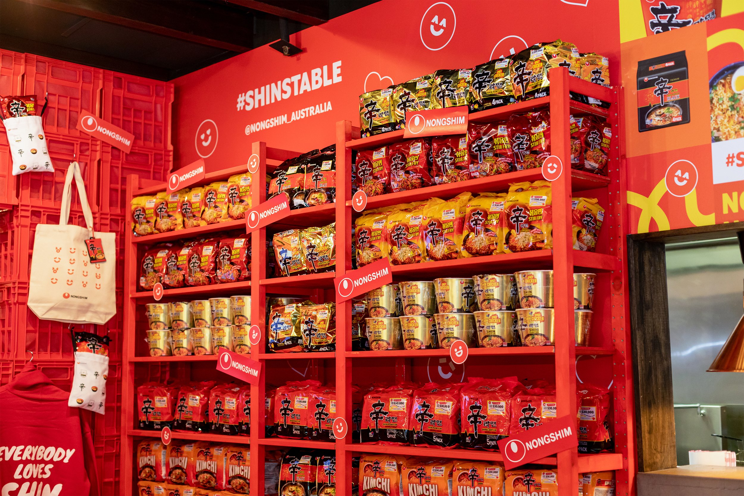
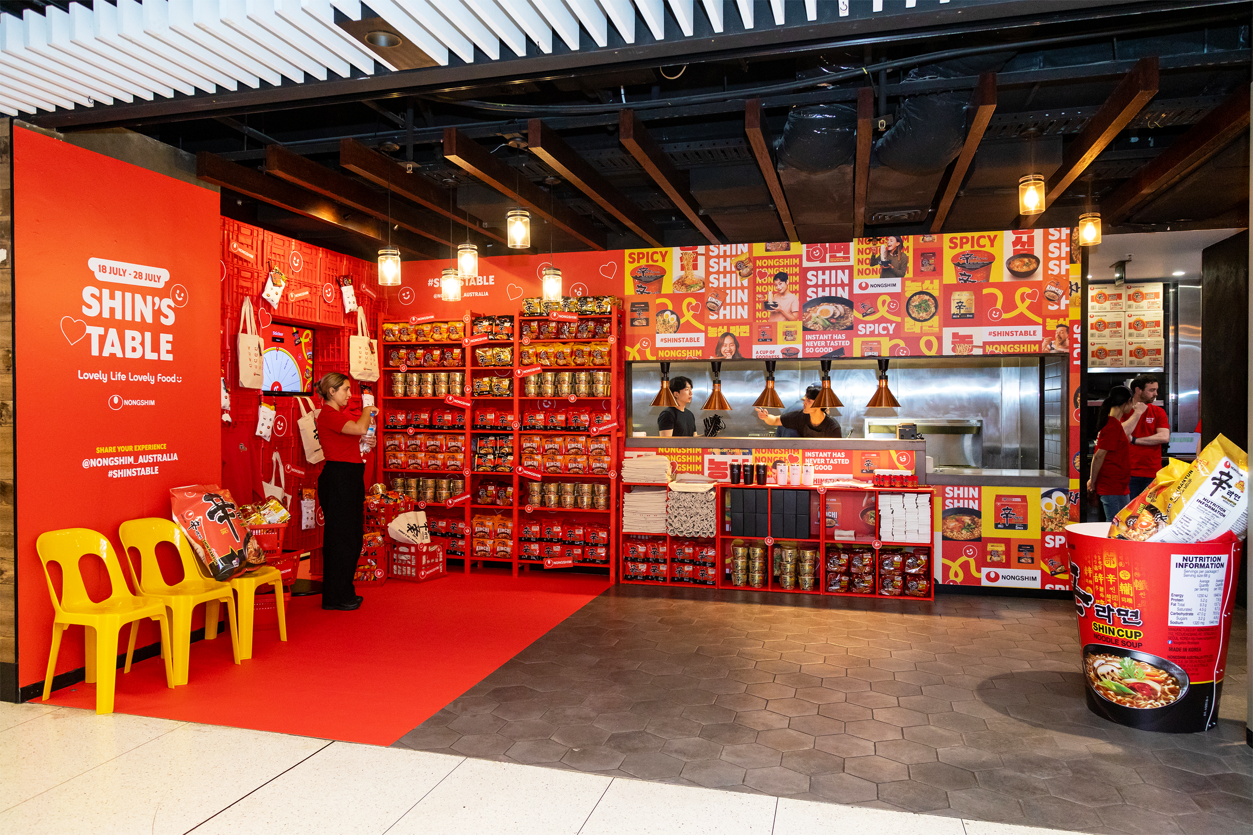
Nongshim’s primary brand colour is red, which we utilised in the photozone to create a dramatic and eye-catching effect. We included plastic crates, red wooden shelves, and shopping baskets to capture a stylish, contemporary Korean convenience store atmosphere. The vibrant red not only grabs attention but also serves as an ideal backdrop for displaying Nongshim ramyun products.
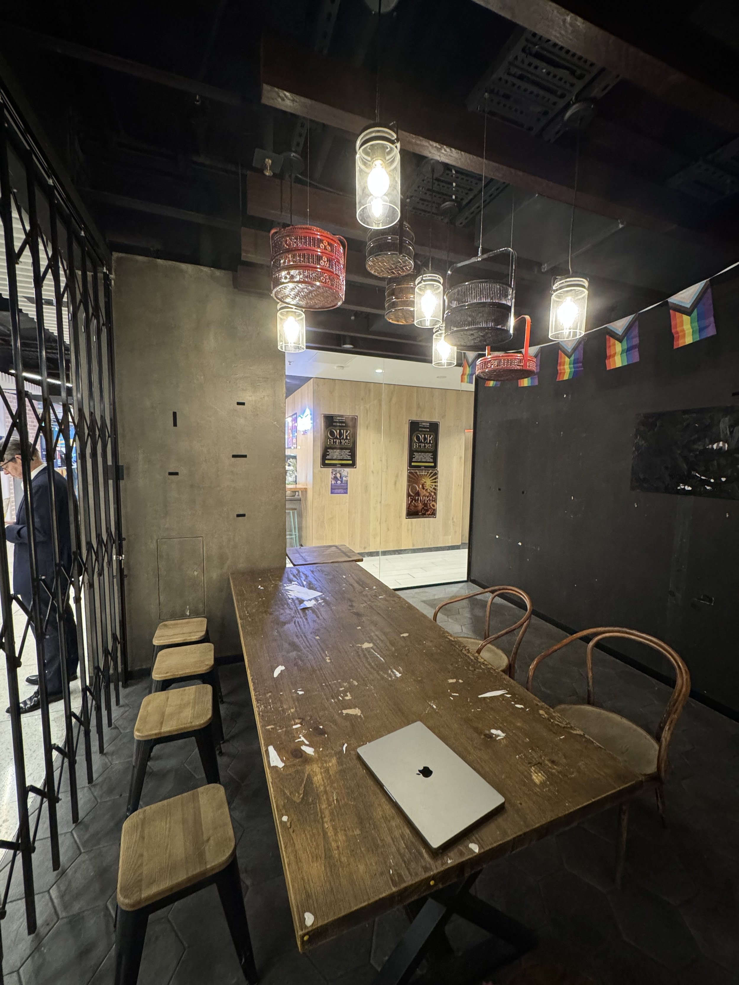
Photozone space (Before)
Photozone mockup (After)
Giant Noodle Cup & Noodle Packs for photo props
Grocery basket as decoration
Shin Roulette Wheel - customers can spin the wheel for a chance to win merchandise
Developed by our web developer, Shinsuke Nakayama.
Customers interaction with the Shin’s Table space


